21 Extract and Visualise Financial Data Information
Hands-On Exercise from Prof Kam’s Workshop
(First Published: Sep 19, 2023)
21.1 Learning Outcome
We are going to explore the tidymodels approach in financial analysis. By the end of this session, you will learn how to:
extract stock price data from an online portal such as Yahoo Finance,
wrangle stock price data,
perform technical analysis using stock price data,
conduct performance analysis
21.2 Introducing tidyquant
tidyquant integrates the best resources for collecting and analyzing financial data, zoo xts, quantmod, TTR and PerformanceAnalytics, with the tidy data infrastructure of the tidyverse allowing for seamless interaction between each.
With tidyquant, we can now perform complete financial analyses using tidyverse framework.
21.2.1 Install and load the R Packages into R Environment
tidyquant allows easy extract of stock data from Yahoo Finance
21.2.2 Extract Financial Data
Data extraction is the starting point of any financial data analysis. tq_get() is specially designed for extracting quantitative financial data from the following online portals:
Yahoo Finance - Daily stock data
FRED - Economic data
Quandl - Economic, Energy, & Financial Data API
Tiingo - Financial API with sub-daily stock data and crypto-currency
Alpha Vantage - Financial API with sub-daily, ForEx, and crypto-currency data Bloomberg - Financial API. Paid account is required.
21.2.3 Import Singapore Companies Data
We are interested to analyse the stock prices of six companies in Singapore. The companies and related information are provided in company.csv file.
The codes below are used to important company.csv into R environment.
# A tibble: 6 × 3
  Name                  Symbol    marketcap
  <chr>                 <chr>         <dbl>
1 DBS Group             D05.SI  55459934603
2 OCBC Bank             O39.SI  36748776904
3 UOB                   U11.SI  31908845153
4 Singtel               Z74.SI  30399495021
5 Singapore Airlines    C6L.SI  11030367619
6 CapitaLand Mall Trust C38U.SI 10479058731
21.2.4 Extract stock prices from Yahoo Finance
tq_get() is used to get stock prices from Yahoo Finance. The time period for the data was set from 1 January 2022 to 30 June 2023.
21.2.5 Wrangle stock data
Next, left_join() of dplyr package is used to append Name and marketcap fields of company tibble data frame into Stock_daily tibble data frame by using Symbol as the join field.
21.3 Technical Analysis: tidyquant methods
Technical analysis is that traders attempt to identify opportunities by looking at statistical trends, such as movements in a stock’s price and volume. The core assumption is that all known fundamentals are factored into price, thus there is no need to pay close attention to them.
Technical analysts do not attempt to measure a security’s intrinsic value. Instead, they use stock charts to identify patterns and trends that suggest what a stock will do in the future.
Popular technical analysis signals include simple moving averages (SMA), candlestick, Bollinger bands.
21.3.1 Plot Stock Price Line Graph: ggplot methods
geom_line() of ggplot2 is used to plot the stock prices.
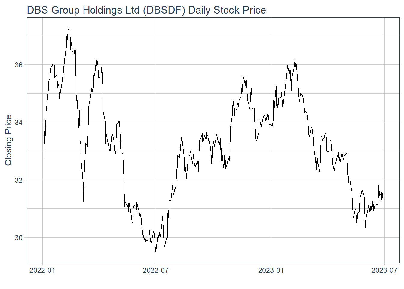
21.3.2 Visualise Stock Price with timetk
In the codes below, plot_time_series() of timetk package is used plot line graphs with trend lines.
21.4 Technical analysis with Candlestick
A candlestick chart (also called Japanese candlestick chart or K-line) is a style of financial chart used to describe price movements of a security, derivative, or currency.
geom_candlestick() of tidyquant is used to plot the stock prices of DBS group.
Show the code
end <- as_date("2023-06-30")
 start <- end - weeks(4)
 Stock_data %>%
 filter(Name == "DBS Group") %>%
 filter(date >= start - days(2 * 15)) %>%
 ggplot(aes(x=date, y=close)) +
 geom_candlestick(aes(open=open,
 high=high,
 low=low,
 close=close)) +
 labs(title = "Daily stock prices of DBS Group", y = "Closing Price", x = 'Date') +
 coord_x_date(xlim = c(start, end)) +
 theme_tq()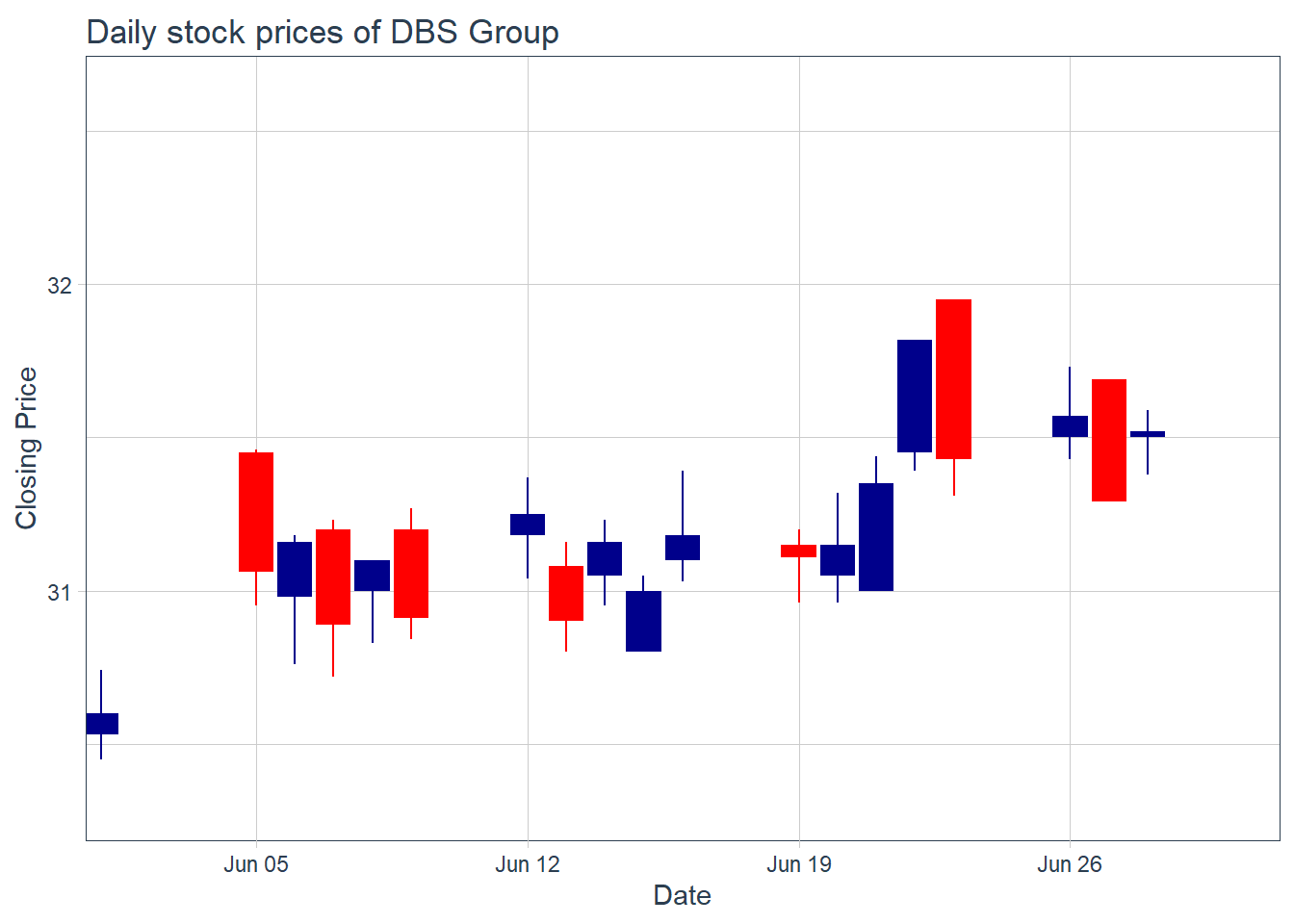
facet_wrap() of ggplot2 package is used to plot the stock prices of the selected six companies.
Show the code
 end <- as_date("2023-06-30")
 start <- end - weeks(4)
 Stock_data %>%
 filter(date >= start - days(2 * 15)) %>%
 ggplot(aes(x=date, y=close, group = Name )) +
 geom_candlestick(aes(open=open,
 high=high,
 low=low,
 close=close)) +
 labs(title = "Daily stock prices of selected six stocks") +
 coord_x_date(xlim = c(start, end)) +
 facet_wrap(~ Name,
 ncol = 2,
 scales = "free_y") +
 theme_tq()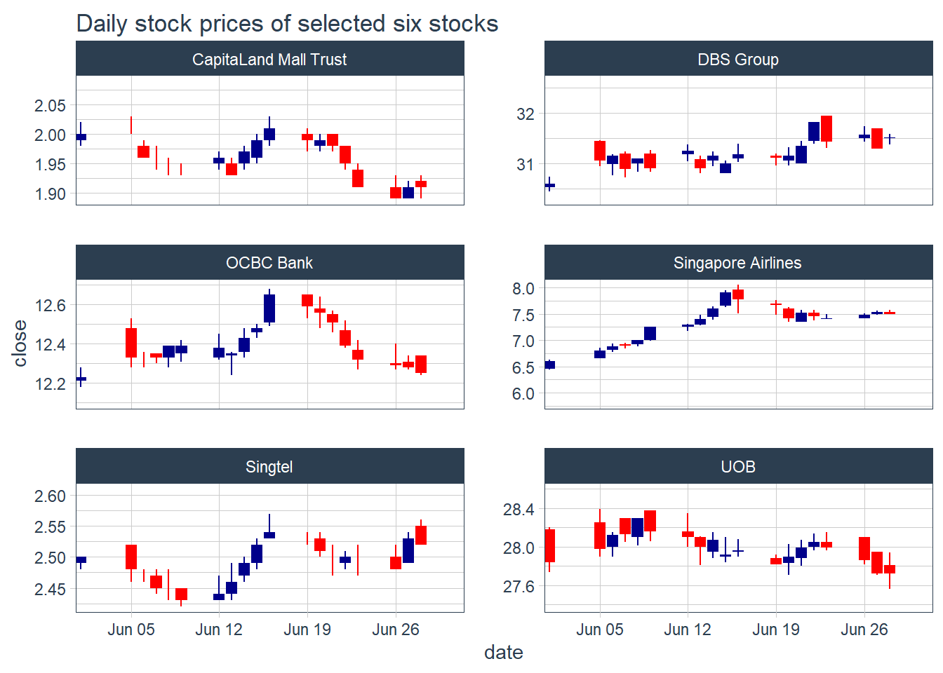
21.5 Technical analysis with moving average
In finance, a moving average (MA) is a stock indicator commonly used in technical analysis. The reason for calculating the moving average of a stock is to help smooth out the price data by creating a constantly updated average price. tidyquant includes geoms to enable “rapid prototyping” to quickly visualize signals using moving averages and Bollinger bands. The following moving averages are available:
Simple moving averages (SMA)
Exponential moving averages (EMA)
Weighted moving averages (WMA)
Double exponential moving averages (DEMA)
Zero-lag exponential moving averages (ZLEMA)
Volume-weighted moving averages (VWMA) (also known as VWAP)
Elastic, volume-weighted moving averages (EVWMA) (also known as MVWAP)
21.5.1 Plot the 5-day and 15-day simple moving average
geom_ma() of tidyquant package is used to overplot two moving average lines on the candlestick chart.
Show the code
# In the code chunk below, of tidyquant package is used to overplot two moving
# average lines on the candlestick chart.
 Stock_data %>%
 filter(Symbol == "D05.SI") %>%
 filter(date >= start - days(2 * 15)) %>%
 ggplot(aes(x = date, y = close)) +
 geom_candlestick(aes(open = open, high = high, low = low, close = close)) +
 geom_ma(ma_fun = SMA, n = 5, linetype = 5, size = 1.25) +
 geom_ma(ma_fun = SMA, n = 15, color = "red", size = 1.25) +
 labs(title = "DBS Group Holdings Ltd Daily Stock Price",
 subtitle = "5 and 15-Day SMA",
 y = "Closing Price", x = "") +
 coord_x_date(xlim = c(end - weeks(5), end)) +
 theme_tq()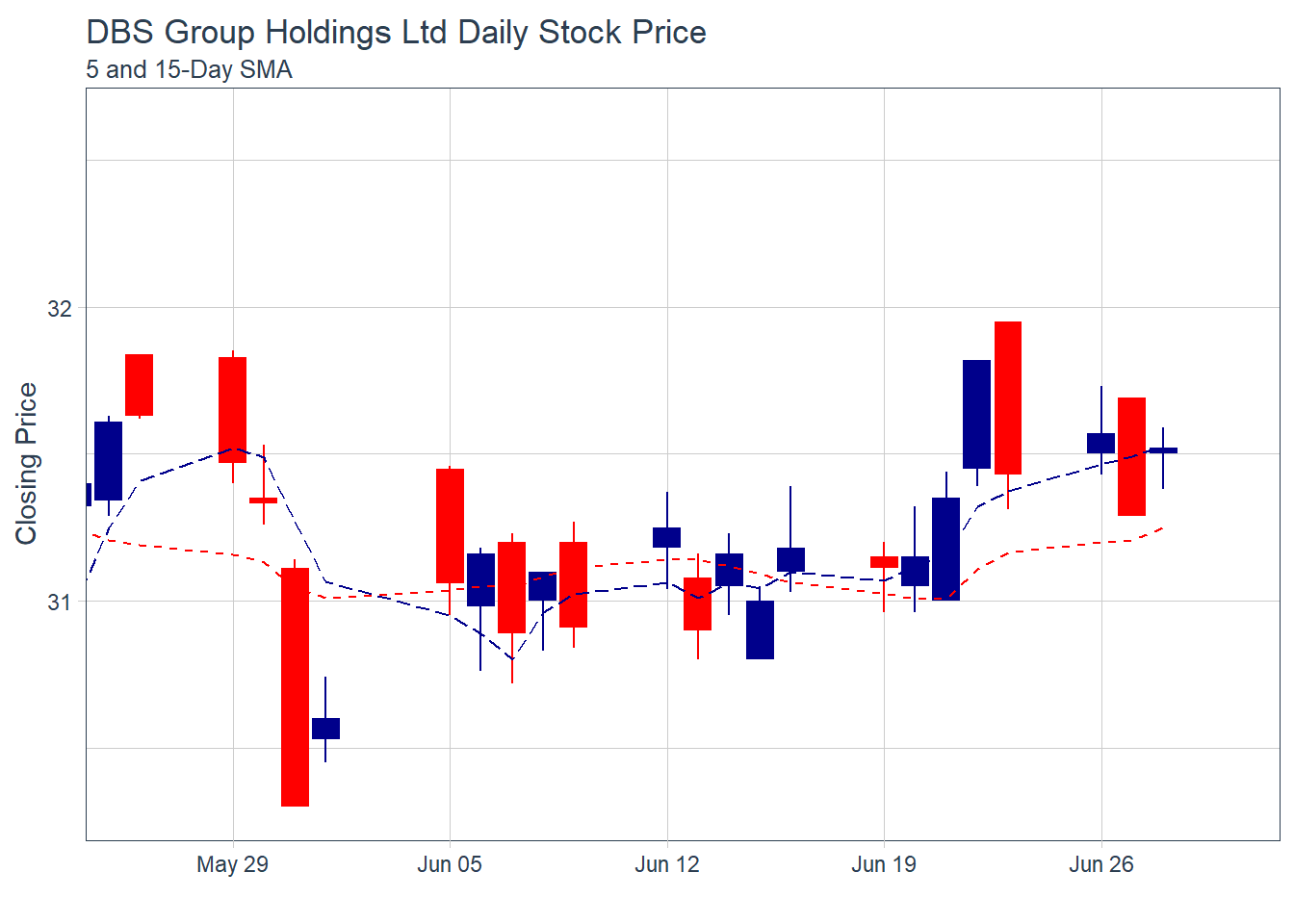
Note: The moving average functions used are specified SMA() in from the TTR package.
21.5.2 Plot Bollinger Band: tidyquant method
A Bollinger Band is a technical analysis tool defined by a set of trendlines plotted two standard deviations (positively and negatively) away from a simple moving average (SMA) of a security’s price, but which can be adjusted to user preferences.
In tidyquant, bollinger band can be plotted by using geom_bbands() . Because they use a moving average, the geom_bbands() works almost identically to geom_ma. The same seven moving averages are compatible. The main difference is the addition of the standard deviation, sd, argument which is 2 by default, and the high, low and close aesthetics which are required to calculate the bands.
geom_bbands() of tidyquant package is used to plot bollinger bands on closing stock prices of DBS Group.
Show the code
 Stock_data %>%
 filter(Name == "DBS Group") %>%
 ggplot(aes(x=date, y=close))+
 geom_line(size=0.5)+
 geom_bbands(aes(
 high = high, low = low, close = close),
 ma_fun = SMA, sd = 2, n = 5,
 size = 0.75, color_ma = "royalblue4",
 color_bands = "red1")+
 coord_x_date(xlim = c("2022-01-01",
 "2022-06-30"),
 expand = TRUE)+
 labs(title = "DBS Group Holdings Ltd Daily Stock Price",
 subtitle = "dotted red lines = bollinger bands",
 x = "Date", y ="Close Price") +
 theme(legend.position="none")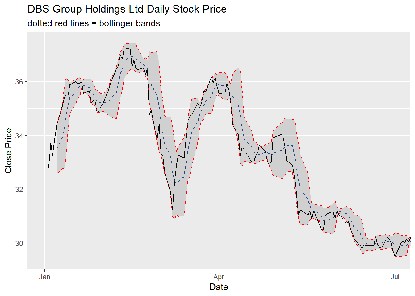
21.6 Performance Analysis with tidyquant
Financial asset (individual stocks, securities, etc) and portfolio (groups of stocks, securities, etc) performance analysis is a deep field with a wide range of theories and methods for analyzing risk versus reward. The PerformanceAnalytics package consolidates functions to compute many of the most widely used performance metrics. tidyquant integrates this functionality so it can be used at scale using the split, apply, combine framework within the tidyverse. Two primary functions integrate the performance analysis functionality:
tq_performance()implements the performance analysis functions in a tidy way, enabling scaling analysis using the split, apply, combine framework.tq_portfolio()provides a useful tool set for aggregating a group of individual asset returns into one or many portfolios.
21.7 Time-based returns analysis with tidyquant
An important concept of performance analysis is based on the statistical properties of returns (not prices). In the codes below, tq_transmute() is used to compute the monthly returns of the six stocks
Show the code
# A tibble: 108 × 3
# Groups:   Name [6]
   Name      date       monthly.returns
   <chr>     <date>               <dbl>
 1 DBS Group 2022-01-31          0.0735
 2 DBS Group 2022-02-28         -0.0392
 3 DBS Group 2022-03-31          0.0594
 4 DBS Group 2022-04-29         -0.0436
 5 DBS Group 2022-05-31         -0.0776
 6 DBS Group 2022-06-30         -0.0407
 7 DBS Group 2022-07-29          0.0603
 8 DBS Group 2022-08-31          0.0472
 9 DBS Group 2022-09-30          0.0242
10 DBS Group 2022-10-31          0.0243
# ℹ 98 more rows
21.8 Visualise time-based returns
Since the output is in tibble data frame format, we can visualise the returns easily by using appropriate ggplot2 functions.
Show the code
 Stock_monthly_returns %>%
 ggplot(aes(x = date,
 y = monthly.returns,
 fill = Name)) +
 geom_col() + # Use bar graph easier to compare performance
 geom_hline(yintercept = 0,
 color = palette_light()[[1]]) +
 scale_y_continuous(labels = scales::percent) +
 labs(title = "Monthly returns of the six selected stocks",
 subtitle = "",
 y = "Monthly Returns", x = "") +
 facet_wrap(~ Name, ncol = 3, scales = "free_y") +
 theme_tq() +
 scale_fill_tq()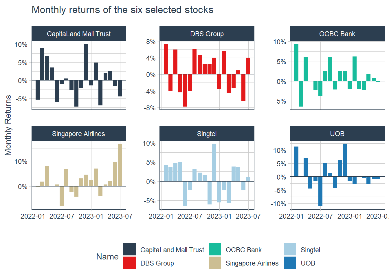
21.9 Portfolio Analysis with tidyquant
Assuming that we have S$100,000 investment in the three local banks since 1st January 2023 until 30th June 2023 and we would like to analyse how our money is growing.
Codes below will be used to import SGBank.csv into R environment.
Next, tq_get() will be used to extract and download the stock prices from Yahoo Finance.
21.9.1 Compute returns of individual bank
In the codes below, tq_transmute() is used to compute the monthly returns for each bank.
The code chunk below can then be used to display the first 10 records.
| Symbol | date | Ra |
|---|---|---|
| D05.SI | 2020-01-31 | -0.0283417 |
| D05.SI | 2020-02-28 | -0.0496649 |
| D05.SI | 2020-03-31 | -0.2297803 |
| D05.SI | 2020-04-30 | 0.0944815 |
| D05.SI | 2020-05-29 | 0.0087390 |
| D05.SI | 2020-06-30 | 0.0683103 |
| D05.SI | 2020-07-30 | -0.0495192 |
| D05.SI | 2020-08-31 | 0.0645860 |
| D05.SI | 2020-09-30 | -0.0459990 |
| D05.SI | 2020-10-30 | 0.0220995 |
tq_portfolio() is used to compute the combined returns of the three local banks.
The codes below can then be used to display the first 10 records.
| date | Ra |
|---|---|
| 2020-01-31 | -0.0282457 |
| 2020-02-28 | -0.0399555 |
| 2020-03-31 | -0.2087409 |
| 2020-04-30 | 0.0647070 |
| 2020-05-29 | -0.0130552 |
| 2020-06-30 | 0.0573243 |
| 2020-07-30 | -0.0470641 |
| 2020-08-31 | 0.0442009 |
| 2020-09-30 | -0.0354886 |
| 2020-10-30 | 0.0084999 |
Visualise the combined portfolio returns
In the codes below, ggplot2 functions are used to prepare a visualisation showing the combined portfolio returns.
Show the code
 ggplot(data = porfolio_returns_monthly,
 aes(x = date, y = Ra)) +
 geom_bar(stat = "identity",
 fill = palette_light()[[1]]) +
 labs(title = "Porfoli Returns",
 subtitle = "40% DBS, 30% OCBC and 30% UOB",
 caption = "Shows an above zero trend meaning positive retuns",
 x = "", y = "Monthly Returns") +
 geom_smooth(method = "lm") +
 theme_tq() +
 scale_color_tq() +
 scale_y_continuous(labels = scales::percent)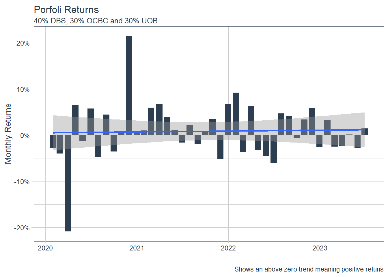
21.9.2 Compute investment growth
Most of the time, we also want to see how our $100,000 initial investment is growing. This is simple with the underlying Return.portfolio argument, wealth.index = TRUE. All we need to do is add these as additional parameters to tq_portfolio()!
21.9.3 Visualise the growth
The codes below will be used to plot the investment growth trends.
Show the code
 ggplot(data = portfolio_growth_monthly,
 aes(x = date, y = investment.growth)) +
 geom_line(size = 1, color = palette_light()[[1]]) +
 labs(title = "Portfolio Growth",
 subtitle = "40% DBS, 30% OCBC, and 30% UOB",
 caption = "Now we can really visualize performance!",
 x = "", y = "Portfolio Value") +
 geom_smooth(method = "loess") +
 theme_tq() +
 scale_color_tq() +
 scale_y_continuous(labels = scales::dollar)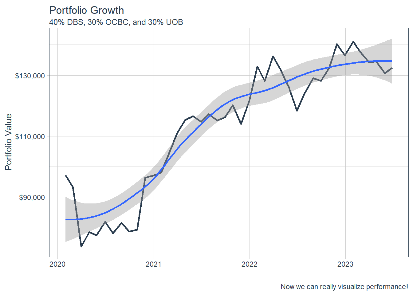
\(**That's\) \(all\) \(folks!**\)