18 Information Dashboard Design
Hands-On Exercise for Week 9
(First Published: Jun 15, 2023)
18.1 Learning Outcome
We will learn how to
create bullet chart by using ggplot2,
create sparklines by using ggplot2 ,
build industry standard dashboard by using R Shiny.
18.2 Getting Started
18.2.1 Install and load the required R libraries
Install and load the the required R packages. The name and function of the new packages that will be used for this exercise are as follow:
- gtExtras provides some additional helper functions to assist in creating beautiful tables with gt, an R package specially designed for anyone to make wonderful-looking tables using the R
- reactable provides functions to create interactive data tables for R, based on the React Table library and made with reactR.
- reactablefmtr provides various features to streamline and enhance the styling of interactive reactable tables with easy-to-use and highly-customizable functions and themes.
- RODBC provides functions to establish connections with ODBC-compliant databases, execute SQL queries, and retrieve data into R for further analysis
18.2.2 Import the data
A personal database in Microsoft Access mdb format called Coffee Chain will be used.
odbcConnectAccess2007() of RODBC package is used to import a database query table into R. The import file is then saved in rds format.
Show the code
# connect to odbc driver to read the mdb file
# the suggested odbcConnectAccess() function does not work for 64-bit machine
# used odbcConnectAccess2007() function instead
con <- odbcConnectAccess2007('data/Coffee Chain.mdb')

# ingest the coffee chain data and assign it to coffeechain variable
coffeechain <- sqlFetch(con, 'CoffeeChain Query')

# write the coffeechain df to rds format
write_rds(coffeechain, "data/CoffeeChain.rds")

# close odbc connection
odbcClose(con)
(Note the above steps should only be run once)
We import CoffeeChain.rds into our working environment for the processing and analysis.
We aggregate Sales and Budgeted Sales at the Product level to generate a product data frame.
18.3 Bullet Chart
The codes below is used to plot the bullet charts using ggplot2 functions.
Show the code
# Plotting the 'product' data with 'Product' on the x-axis and 'current' on the y-axis
ggplot(product, aes(Product, current)) +

  # Adding a column geom for the upper bound of the target values
  # This provides the slightly darker=toned gray frame for the plot
  geom_col(aes(Product, max(target) * 1.01),
           fill = "grey85", width = 0.85) +

  # Adding a column geom for the mid-range of the target values
  geom_col(aes(Product, target * 0.75),
           fill = "grey60", width = 0.85) +

  # Adding a column geom for the lower bound of the target values
  geom_col(aes(Product, target * 0.5),
           fill = "grey50", width = 0.85) +

  # Adding a column geom for the current values
  geom_col(aes(Product, current),
           width = 0.35,
           fill = "black") +

  # Adding error bars based on the target values
  geom_errorbar(aes(y = target,
                    x = Product,
                    ymin = target,
                    ymax = target),
                width = 0.4,
                colour = "red",
                size = 1) +

  # Flipping the coordinates to have horizontal bars
  coord_flip()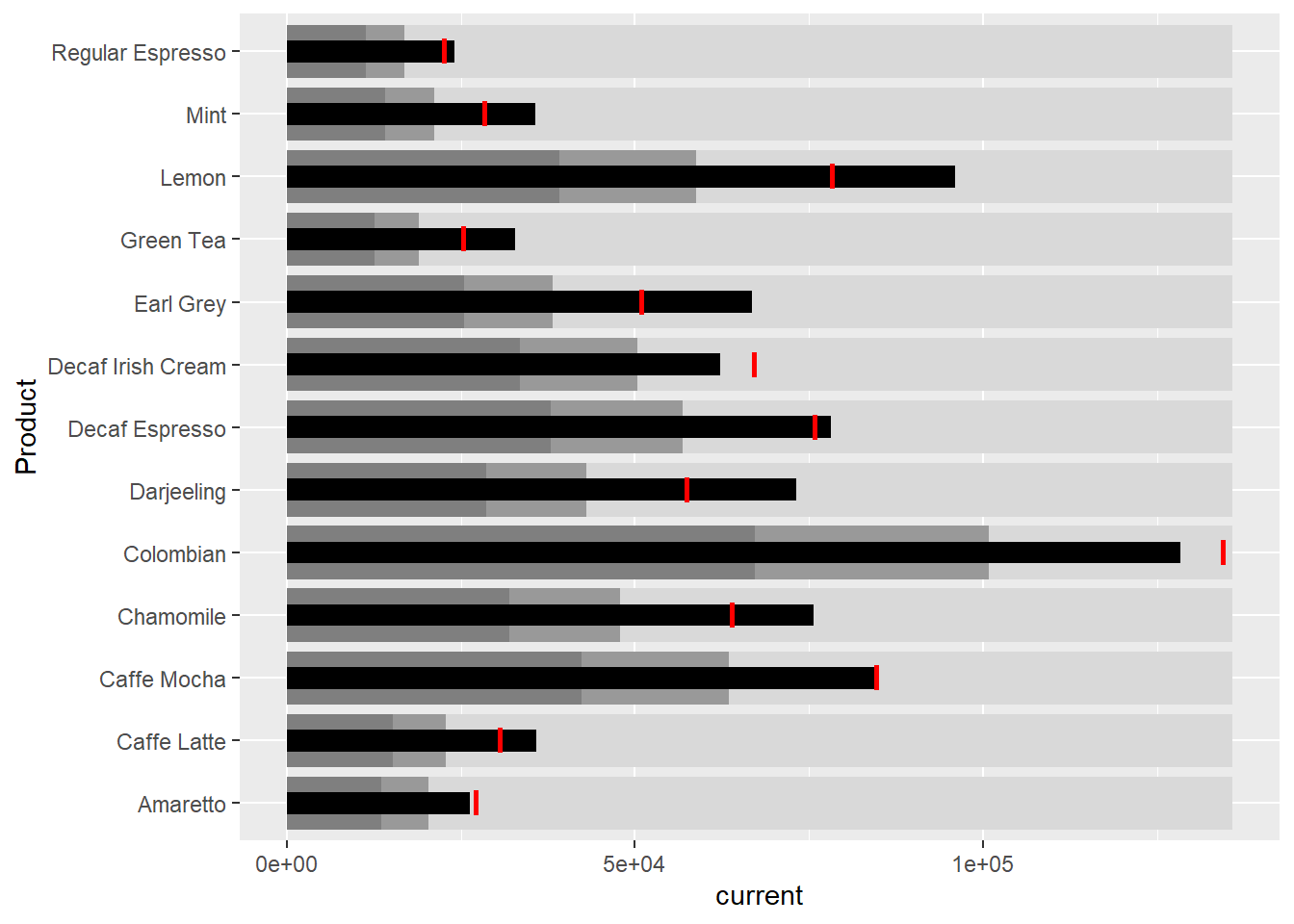
The red strip is the target
The black bar is the current achievement
The 2 tone gray bars are the target values at 50% and 75%
18.4 Sparklines
Prepare the data
We aggregate the data from the coffee chain data frame to derive the monthly sales by product
We then compute the minimum, maximum and end othe the month sales.
Show the code
# Grouping the 'sales_report' data by 'Product' and selecting the row with the minimum 'Sales' value for each group
mins <- group_by(sales_report, Product) %>%
  slice(which.min(Sales))

# Grouping the 'sales_report' data by 'Product' and selecting the row with the maximum 'Sales' value for each group
maxs <- group_by(sales_report, Product) %>%
  slice(which.max(Sales))

# Grouping the 'sales_report' data by 'Product' and selecting the rows where the 'Month' is equal to the maximum 'Month' value
ends <- group_by(sales_report, Product) %>%
  filter(Month == max(Month))
Next, we compute the 25th and 75 quantiles
Plot the chart
Show the code
ggplot(sales_report, aes(x=Month, y=Sales)) +
  facet_grid(Product ~ ., scales = "free_y") +
  geom_ribbon(data = quarts, aes(ymin = quart1, max = quart2),
              fill = 'grey90') +
  geom_line(size=0.3) +
  geom_point(data = mins, col = 'red') +
  geom_point(data = maxs, col = 'blue') +
  geom_text(data = mins, aes(label = Sales), vjust = -1) +
  geom_text(data = maxs, aes(label = Sales), vjust = 2.5) +
  geom_text(data = ends, aes(label = Sales), hjust = 0, nudge_x = 0.5) +
  geom_text(data = ends, aes(label = Product), hjust = 0, nudge_x = 1.0) +
  expand_limits(x = max(sales_report$Month) +
                  (0.25 * (max(sales_report$Month) - min(sales_report$Month)))) +
  scale_x_continuous(breaks = seq(1, 12, 1)) +
  scale_y_continuous(expand = c(0.1, 0)) +
  theme_tufte(base_size = 3, base_family = "Helvetica") +
  theme(axis.title=element_blank(), axis.text.y = element_blank(),
        axis.ticks = element_blank(), strip.text = element_blank())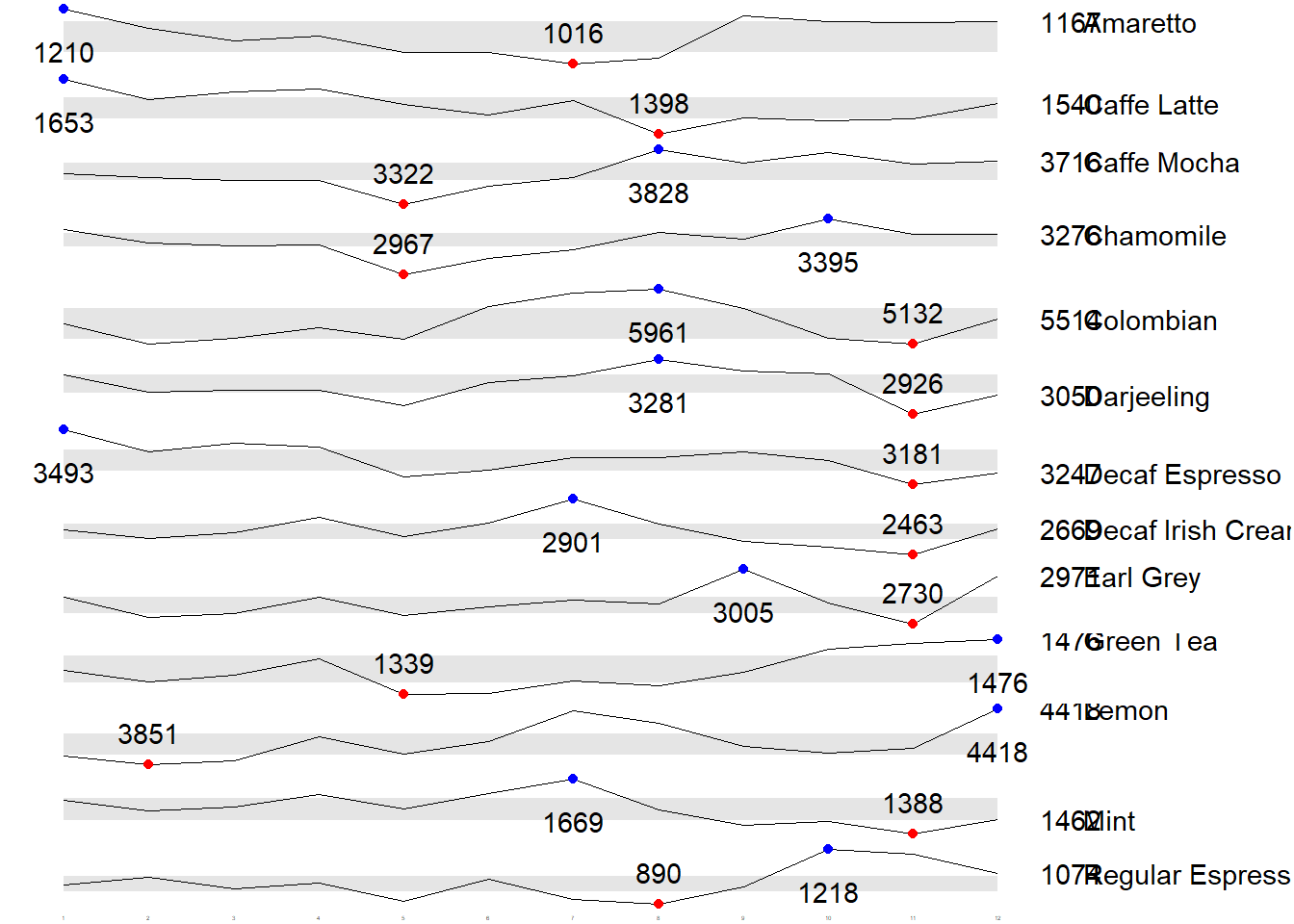
18.5 Static Information Dashboard Design
Next, we will learn how to create static information dashboard by using gt and gtExtras packages. Visit the webpage of these two packages and review all the materials provided on the webpages at least once.
18.5.1 Plot a simple bullet chart
We prepare a bullet chart report by using functions of gt and gtExtras packages.
Show the code
| Product | current |
|---|---|
| Amaretto | |
| Caffe Latte | |
| Caffe Mocha | |
| Chamomile | |
| Colombian | |
| Darjeeling | |
| Decaf Espresso | |
| Decaf Irish Cream | |
| Earl Grey | |
| Green Tea | |
| Lemon | |
| Mint | |
| Regular Espresso |
18.5.2 Create Sparklines using gtExtrad method
Prepare the data
We extract the sales for 2013 and group the results by product and month.
gtExtras functions require us to pass a data frame with list columns. In view of this, codes below will be used to convert the report data.frame into list columns.
Show the code
# A tibble: 13 × 2
   Product           `Monthly Sales`
   <chr>             <list>
 1 Amaretto          <dbl [12]>
 2 Caffe Latte       <dbl [12]>
 3 Caffe Mocha       <dbl [12]>
 4 Chamomile         <dbl [12]>
 5 Colombian         <dbl [12]>
 6 Darjeeling        <dbl [12]>
 7 Decaf Espresso    <dbl [12]>
 8 Decaf Irish Cream <dbl [12]>
 9 Earl Grey         <dbl [12]>
10 Green Tea         <dbl [12]>
11 Lemon             <dbl [12]>
12 Mint              <dbl [12]>
13 Regular Espresso  <dbl [12]>
Plot the sparklines
We pass the data frame with list columns throught the gt() function followed by the the gt_plt_sparkline() function to get the table of plots.
Show the code
| Product | Monthly Sales |
|---|---|
| Amaretto | |
| Caffe Latte | |
| Caffe Mocha | |
| Chamomile | |
| Colombian | |
| Darjeeling | |
| Decaf Espresso | |
| Decaf Irish Cream | |
| Earl Grey | |
| Green Tea | |
| Lemon | |
| Mint | |
| Regular Espresso |
Add statistics to the table
We can calculate the min, max and average for each product and display them in a gt table
Show the code
| Product | Min | Max | Average |
|---|---|---|---|
| Amaretto | 1016 | 1210 | 1,119.00 |
| Caffe Latte | 1398 | 1653 | 1,528.33 |
| Caffe Mocha | 3322 | 3828 | 3,613.92 |
| Chamomile | 2967 | 3395 | 3,217.42 |
| Colombian | 5132 | 5961 | 5,457.25 |
| Darjeeling | 2926 | 3281 | 3,112.67 |
| Decaf Espresso | 3181 | 3493 | 3,326.83 |
| Decaf Irish Cream | 2463 | 2901 | 2,648.25 |
| Earl Grey | 2730 | 3005 | 2,841.83 |
| Green Tea | 1339 | 1476 | 1,398.75 |
| Lemon | 3851 | 4418 | 4,080.83 |
| Mint | 1388 | 1669 | 1,519.17 |
| Regular Espresso | 890 | 1218 | 1,023.42 |
We can also combine the sparklines table and the statistics table into one by joining them together.
Show the code
# prepare the sparkline table
spark <- report %>%
  group_by(Product) %>%
  summarise('Monthly Sales' = list(Sales),
            .groups = "drop")

# prepare the summary statistics table
stats <- report %>%
  group_by(Product) %>%
  summarise("Min" = min(Sales, na.rm = T),
            "Max" = max(Sales, na.rm = T),
            "Average" = mean(Sales, na.rm = T)
            )

# combine the 2 tables together
sales_data = left_join(stats,spark)

# Generate the GT table
sales_data %>%
  gt() %>%
  gt_plt_sparkline('Monthly Sales',
same_limit = FALSE)| Product | Min | Max | Average | Monthly Sales |
|---|---|---|---|---|
| Amaretto | 1016 | 1210 | 1119.000 | |
| Caffe Latte | 1398 | 1653 | 1528.333 | |
| Caffe Mocha | 3322 | 3828 | 3613.917 | |
| Chamomile | 2967 | 3395 | 3217.417 | |
| Colombian | 5132 | 5961 | 5457.250 | |
| Darjeeling | 2926 | 3281 | 3112.667 | |
| Decaf Espresso | 3181 | 3493 | 3326.833 | |
| Decaf Irish Cream | 2463 | 2901 | 2648.250 | |
| Earl Grey | 2730 | 3005 | 2841.833 | |
| Green Tea | 1339 | 1476 | 1398.750 | |
| Lemon | 3851 | 4418 | 4080.833 | |
| Mint | 1388 | 1669 | 1519.167 | |
| Regular Espresso | 890 | 1218 | 1023.417 |
18.5.3 Combine bullet chart and sparklines
Usually a similar approach, we can further combine the bullet chart with the combined statistics and sparklines table above.
Show the code
# Prepare the data for bullet chart
bullet <- coffeechain %>%
  filter(Date >= "2013-01-01") %>%
  group_by(`Product`) %>%
  summarise(`Target` = sum(`Budget Sales`),
            `Actual` = sum(`Sales`)) %>%
  ungroup()

# left join sales_data  with the bullet chart data frame
sales_data = sales_data %>%
  left_join(bullet)


# generate the "everything into one" table
sales_data %>%
  gt() %>%
  gt_plt_sparkline('Monthly Sales',
                   # the following argument ensures that each sparkline graph has its own y-axis
                   same_limit = FALSE) %>%
  gt_plt_bullet(column = Actual,
                target = Target,
                width = 40,
                palette = c("lightblue",
                          "black")) %>%
gt_theme_538() | Product | Min | Max | Average | Monthly Sales | Actual |
|---|---|---|---|---|---|
| Amaretto | 1016 | 1210 | 1119.000 | ||
| Caffe Latte | 1398 | 1653 | 1528.333 | ||
| Caffe Mocha | 3322 | 3828 | 3613.917 | ||
| Chamomile | 2967 | 3395 | 3217.417 | ||
| Colombian | 5132 | 5961 | 5457.250 | ||
| Darjeeling | 2926 | 3281 | 3112.667 | ||
| Decaf Espresso | 3181 | 3493 | 3326.833 | ||
| Decaf Irish Cream | 2463 | 2901 | 2648.250 | ||
| Earl Grey | 2730 | 3005 | 2841.833 | ||
| Green Tea | 1339 | 1476 | 1398.750 | ||
| Lemon | 3851 | 4418 | 4080.833 | ||
| Mint | 1388 | 1669 | 1519.167 | ||
| Regular Espresso | 890 | 1218 | 1023.417 |
18.6 Interactive Information Dashboard Design
In this section, we will learn how to create interactive information dashboard by using reactable and reactablefmtr packages.
In order to build an interactive sparklines, we need to install dataui R package by using the codes below.
(the above code should only be run once)
We then load the package for use.
18.6.1 Plotting interactive sparklines
Similar to gtExtras, to plot an interactive sparklines by using reactablefmtr package we need to prepare the list field by using the codes below.
Next, react_sparkline() function is used to plot the sparklines as shown below.
Show the code
Add points and labels
highlight_points argument is used to show the minimum and maximum values points and label argument is used to label first and last values.
Show the code
reactable(
  report,
  defaultPageSize = 13,
  columns = list(
    Product = colDef(maxWidth = 200),
    `Monthly Sales` = colDef(
      cell = react_sparkline(
        report,
        # use highligt_points to display min and max value
        highlight_points = highlight_points(
          min = "red", max = "blue"),
        labels = c("first", "last")
        )
    )
  )
)
Add Reference Line
statline argument is used to show the mean line.
Show the code
Add bandline
Bandline can be added by using the bandline argument.
Show the code
Change from sparkline to sparkbar
We use the react_sparkbar() function to replace lines with bars.
Show the code
\(**That's\) \(all\) \(folks!**\)