3 Quantile–quantile plots
In-Class Exercise for Week 4
(First published: May 6, 2023)
1.Load the required packages
2.Load the data-set into R
3.Visualise Normal Distribution
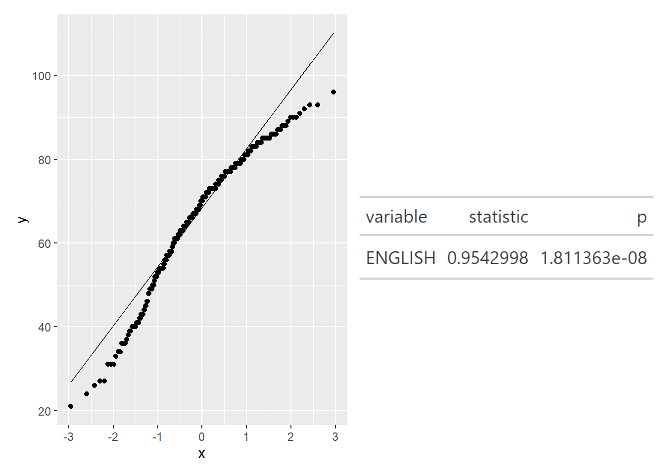
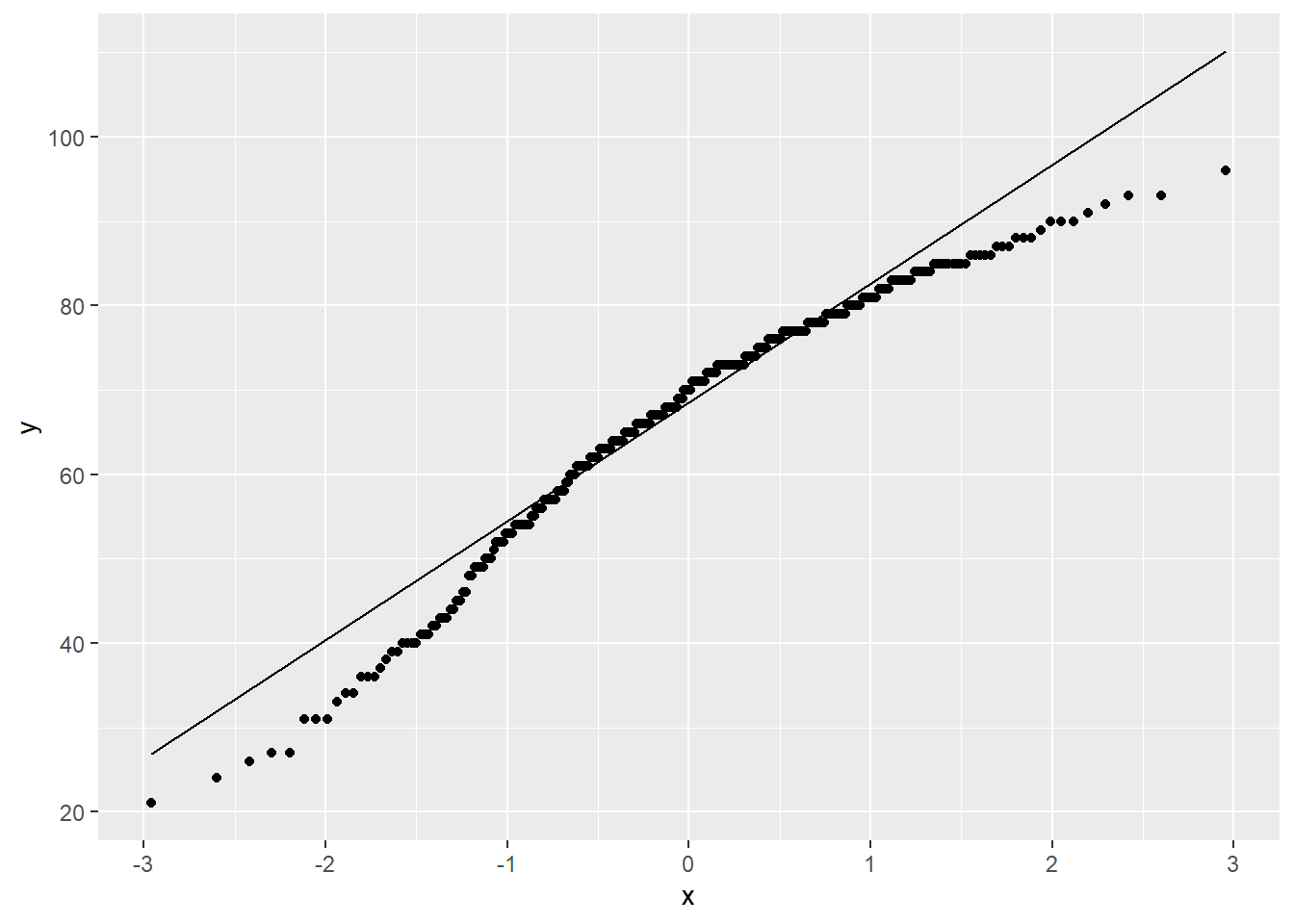
Quantile–quantile (Q-Q) plots are a useful visualization when we want to determine to what extent the observed data points do or do not follow a given distribution. If the data is normally distributed, the points in a Q-Q plot will be on a straight diagonally line. Conversely, if the points deviate significantly from the straight diagonally line, then it’s less likely that the data is normally distributed.
Note
We can see that the points deviate significantly from the straight diagonal line. This is a clear indication that the set of data is not normally distributed.
4.Combining statistical graph and analysis table
We will need to install webshot2