4 Animated Statistical Graph with R
Hands-On Exercise for Week 3
(First Published: 26-Apr-2023)
4.1 Learning Outcome
When telling a visually-driven data story, animated graphics tends to attract the interest of the audience and make deeper impression than static graphics. We will learn to create animated data visualisation. At the same time, we will also learn to reshape, process, wrangle and transform the data-set.
4.1.1 Basic concept of animation
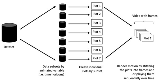
When creating animations, the plot does not actually move. Instead, many individual plots are built and then stitched together as movie frames, just like an old-school flip book or cartoon. Each frame is a different plot, which is built using a relevant subset of the data-set. Motion (and the animated effect) appears when the stitched plots are displayed sequentially.
4.1.2 Terminologies
Before we dive into the steps for creating an animated statistical graph, it’s important to understand some of the key concepts and terminologies that will be used:
Frame: In an animated line graph, each frame represents a different point in time or a different category. When the frame changes, the data points on the graph are updated to reflect the new data.
Animation Attributes: The animation attributes are the settings that control how the animation behaves. For example, we can specify the duration of each frame, the easing function used to transit between frames, and whether to start the animation from the current frame or from the beginning.
Before we start making animated graphs, we should first ask ourselves: Does it makes sense to go through the effort? If we are conducting an exploratory data analysis, a animated graphic may not be worth the time investment. However, if we are giving a presentation, a few well-placed animated graphics can help an audience connect with our topic remarkably better than static counterparts.
4.2 Getting Started
4.2.1 Install and load the required r libraries
Install and load the the required R packages. The name and function of the new package that will be used for this exercise are as follow:
gganimate: creates animated graphics, such as line charts, bar charts, and maps, by specifying a series of frames with data and aesthetics that change over time
gifski: converts images to GIF animations using pngquant’s efficient cross-frame palettes and temporal dithering with thousands of colors per frame.
gapminder: An excerpt of the data available at Gapminder.org. We just want to use its country_colors scheme.
readxl: makes it easy to get data out of Excel and into R
4.2.2 Import the data
The Data worksheet from GlobalPopulation Excel workbook will be used. We will use the following functions to process the data-set:
read_xls()of readxl package is used to import the Excel worksheet.mutate_if()of dplyr package is used to a subset of columns in a data frame based on a logical conditionmutate()of dplyr package is used to convert data values of Year field into integer.
4.3 Animated data visualisation
The basic ggplot2 functions are used to create the static bubble plot.
Show the code
This is because all data points for all featured countries across all years were plotted on a single chart. Read on to see the magic of animated charts 😜.
4.3.1 Working with gganimate package
gganimate extends the grammar of graphics as implemented by ggplot2 to include the description of animation. It does this by providing a range of new grammar classes that can be added to the plot object in order to customise how it should change with time.
transition_*()defines how the data should be spread out and how it relates to itself across time.view_*()defines how the positional scales should change along the animation.shadow_*()defines how data from other points in time should be presented in the given point in time.enter_*()/exit_*()defines how new data should appear and how old data should disappear during the course of the animation.ease_aes()defines how different aesthetics should be eased during transitions.
Building the animated bubble plot
In the following chart:
transition_time()is used to create transition through distinct states in time (i.e. Year).ease_aes()is used to control easing of aesthetics. The default islinear. Other methods are: quadratic, cubic, quartic, quintic, sine, circular, exponential, elastic, back, and bounce.
Show the code
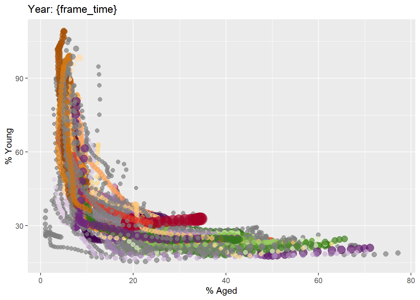
ggplot(globalPop, aes(x = Old, y = Young,
                      size = Population,
                      colour = Country)) +
  geom_point(alpha = 0.7,
             show.legend = FALSE) +
  scale_colour_manual(values = country_colors) +
  scale_size(range = c(2, 12)) +
  labs(title = 'Year: {frame_time}',
       x = '% Aged',
y = '% Young') +
transition_time(Year) +
ease_aes(y = 'linear') 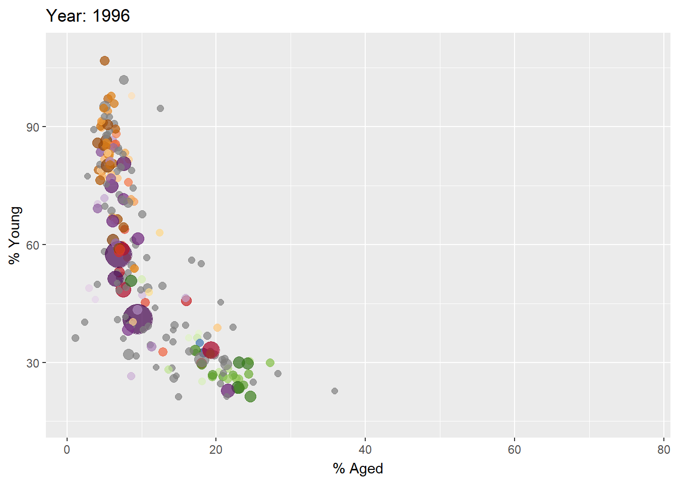
4.3.2 Working with plotly package
In Plotly R package, both ggplotly() and plot_ly() support key frame animations through the frame argument/aesthetic. They also support an ids argument/aesthetic to ensure smooth transitions between objects with the same id (which helps facilitate object constancy).
In the following graph, ggplotly() is used to convert the ggplot2 graph into an animated object.
ggplotly(gg)
Show the code
gg <- ggplot(globalPop,
       aes(x = Old,
           y = Young,
           size = Population,
           colour = Country)) +
  geom_point(aes(size = Population,
                 frame = Year),
             alpha = 0.7,
             show.legend = FALSE) +
  scale_colour_manual(values = country_colors) +
  scale_size(range = c(2, 12)) +
  labs(x = '% Aged',
       y = '% Young') +
  theme(legend.position='none')

ggplotly(gg)
In this next graph, we will use plot_ly() function to create the animated bubble plot.
Show the code
bp <- globalPop %>%
  plot_ly(x = ~Old,
          y = ~Young,
          size = ~Population,
          color = ~Continent,
          frame = ~Year,
          text = ~Country,
          hoverinfo = "text",
          type = 'scatter',
          mode = 'markers') %>%
  layout(xaxis=list(title='% Old',
                showgrid=FALSE,
                zeroline=FALSE,
                showticklabels=FALSE),
         yaxis=list(title='% Young'))
bp
4.4 Reference
Visit this link for a very interesting implementation of gganimate by your senior.
How to change the yaxis linecolor in the horizontal bar? - Plotly R, MATLAB, Julia, Net / Plotly R - Plotly Community Forum: This helps to resolve the black y-axis in the last bubble plot. The interesting finding is that we have to set the x-axis’s zeroline argument to FALSE to resolve the issue 😅.
\(**That's\) \(all\) \(folks!**\)