2 Beyond ggplot2 Fundamentals
Hands-On Exercise for Week 2
Published: 20-Apr-2023
Modified: 27-Apr-2023
2.1 Learning Outcome
We will learn to plot charts that are beyond the out-of-the-box offerings from ggplot2. We will explore how to customize and extend ggplot2 with new:
Annotations
Themes
Composite plots
2.2 Getting Started
2.2.1 Install and load the required r libraries
Install and load the the required R packages. The name and function of the new packages that will be used for this exercise are as follow:
ggrepel: provides a way to prevent labels from overlapping in ggplot2 plots
ggthemes: provides a set of additional themes, geoms and scales for ggplot2
hrbrthemes👍🏾: provides another set of visually appealing themes and formatting options for ggplot2
patchwork👍🏾: provides a way to combine multiple ggplot2 plots into a single figure
2.2.2 Import the data
We will be using the same exam scores data-set that was featured in my Hands-On Ex 1.
2.3 Beyond ggplot2 Annotation
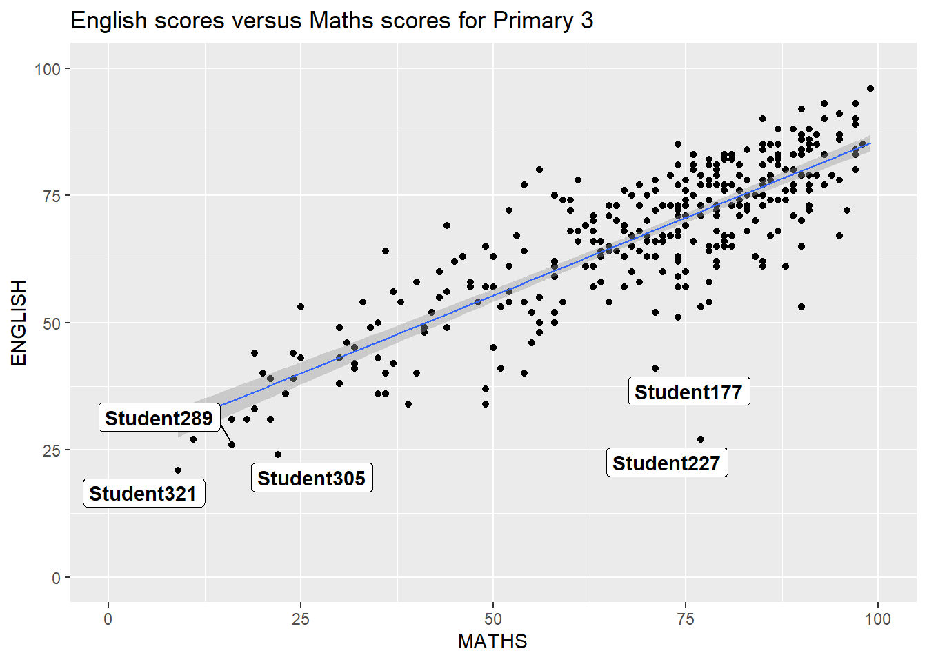
One challenge in plotting statistical graph is annotation, especially with large number of data points. The data points overlap and this leads to an ugly chart.
Show the code
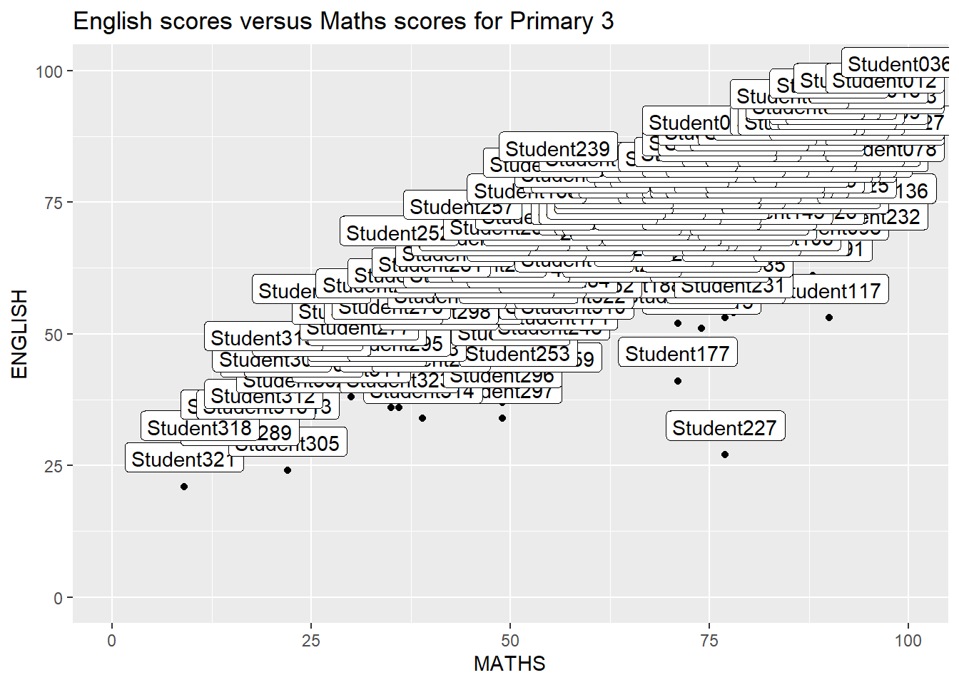
2.3.1 Working with ggrepel package
ggrepel is an extension of ggplot2 package which provides geoms for ggplot2 to repel overlapping text. We simply replace geom_text() by geom_text_repel() and geom_label() by geom_label_repel().
geom_text_repel() adds text directly to the plot. geom_label_repel() draws a rectangle underneath the text, making it easier to read.
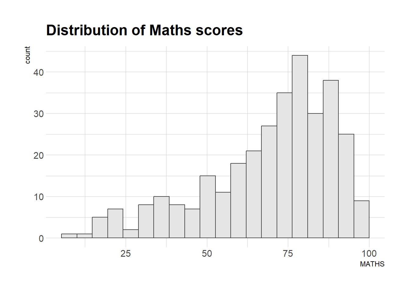
2.4 Beyond ggplot2 Themes
ggplot2 comes with eight built-in themes, they are: theme_gray(), theme_bw(), theme_classic(), theme_dark(), theme_light(), theme_linedraw(), theme_minimal(), and theme_void(). 4 of these themes were featured in my Hands-On-Ex1 page.
Show the code
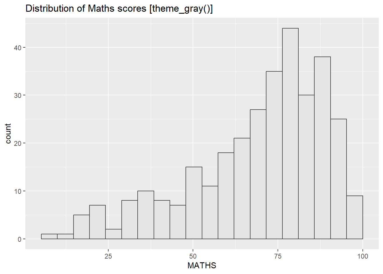
Consider using theme_gray(), theme_bw() or theme_light() as they offer bounded axis which helps to compartmentalize the different plots.
2.4.1 Working with ggthemes package
ggthemes provides ‘ggplot2’ themes that replicate the look of plots by Edward Tufte, Stephen Few, Fivethirtyeight, The Economist, ‘Stata’, ‘Excel’, and The Wall Street Journal, among others.
Check out some of the available themes below 👇🏼.
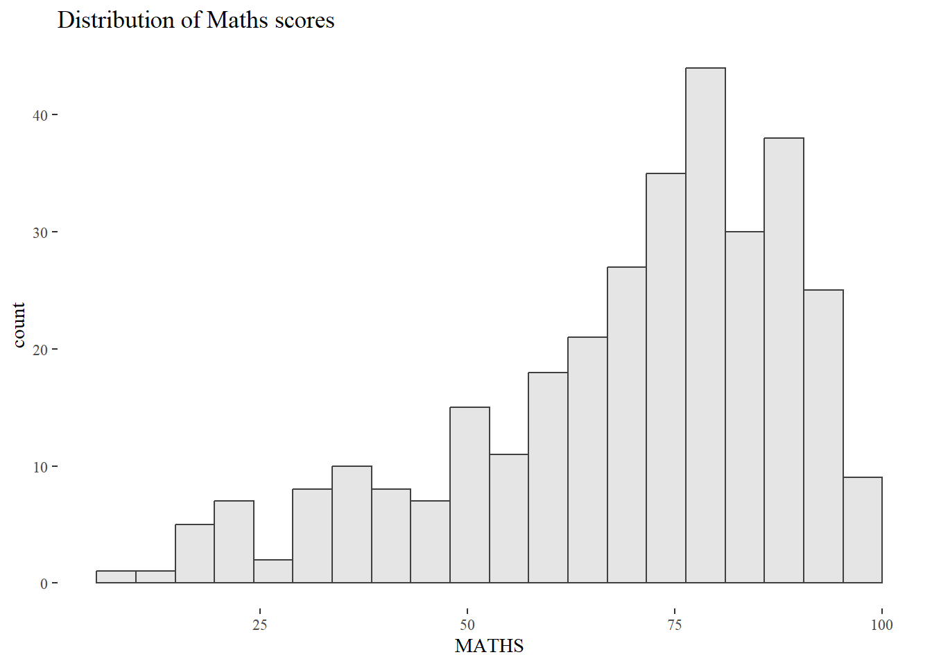
The package also provides some extra geoms and scales for ‘ggplot2’. Consult this vignette to learn more.
2.4.2 Working with hrbthems package
hrbrthemes package provides a base theme that focuses on typographic elements, including where various labels are placed as well as the fonts that are used.
Show the code
The second goal centers around productivity for a production workflow. In fact, this “production workflow” is the context for where the elements of hrbrthemes should be used. It allows us, the data analysts, to focus on the analysis while the package works behind the scene to produce an elegant chart. Consult this vignette to learn more.
Show the code
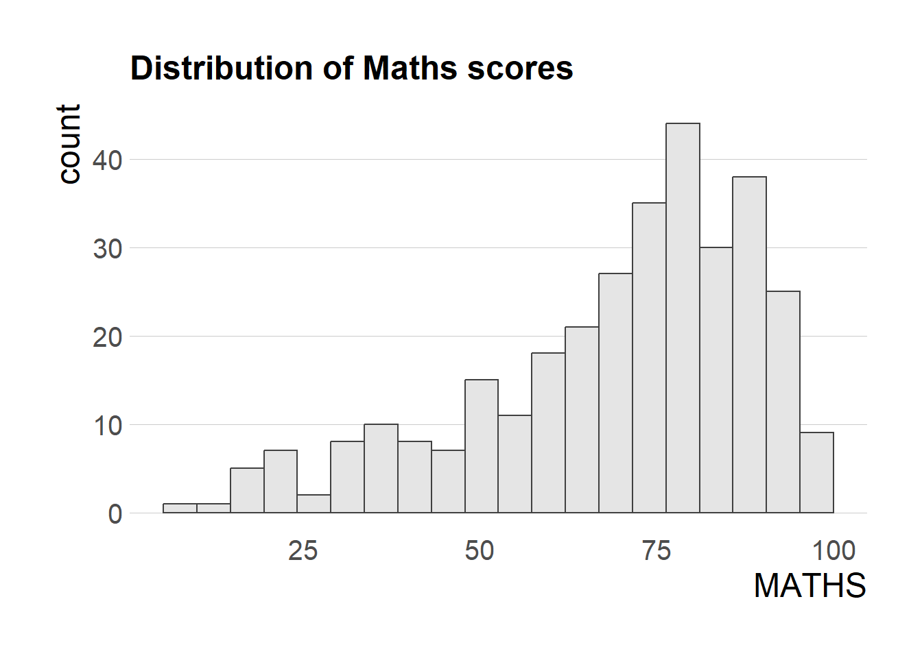
axis_title_sizeargument is used to increase the font size of the axis title to 18,base_sizeargument is used to increase the default axis label to 15, andgridargument is used to remove the x-axis grid lines.
2.5 Beyond ggplot2 facet
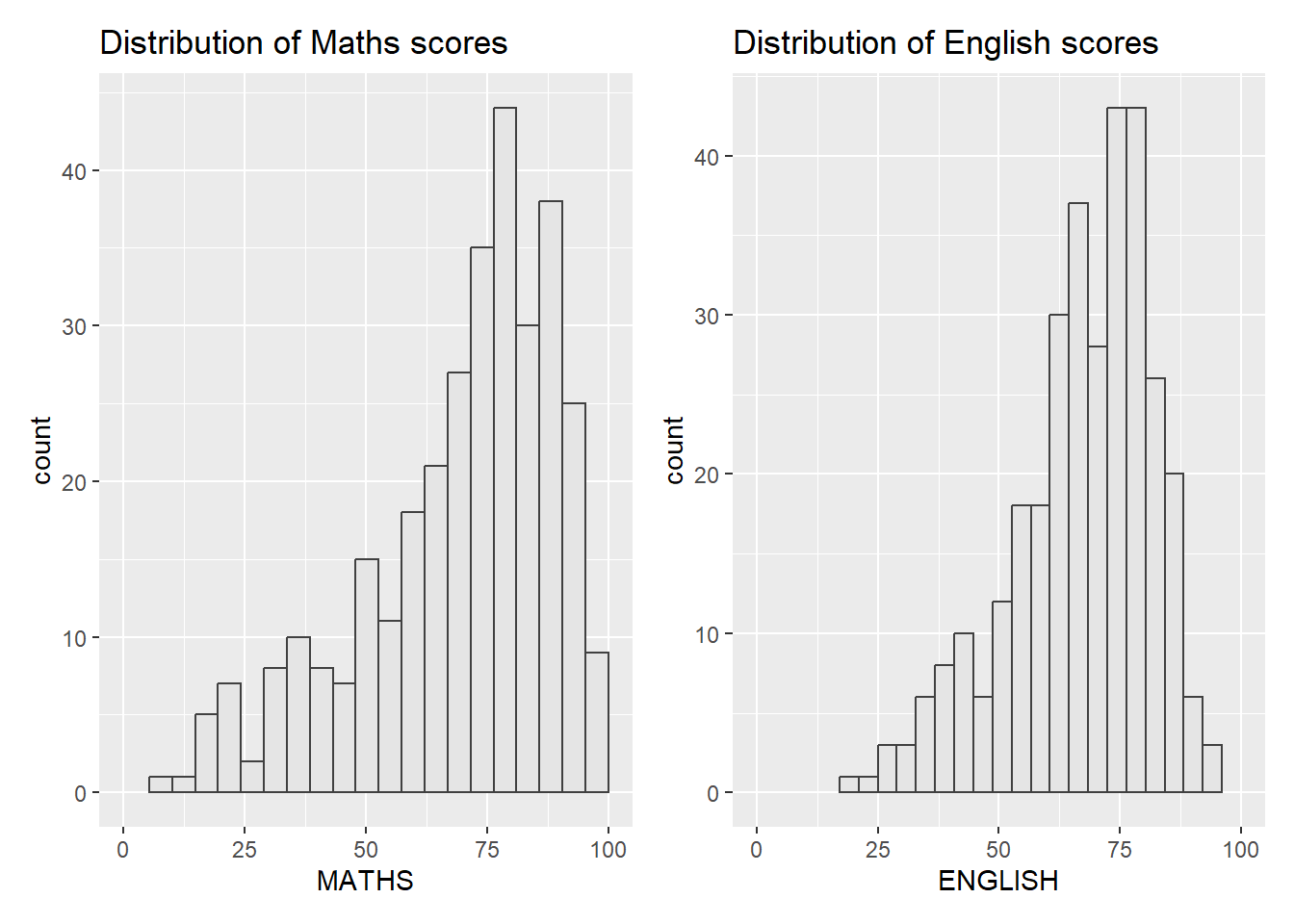
It is not unusual that multiple graphs are required to tell a compelling visual story. There are several ggplot2 extensions provide functions to compose a figure with multiple graphs. In this section, we will learn how to create a composite plot by combining multiple graphs. First, let us create three statistical graphs.
Show the code
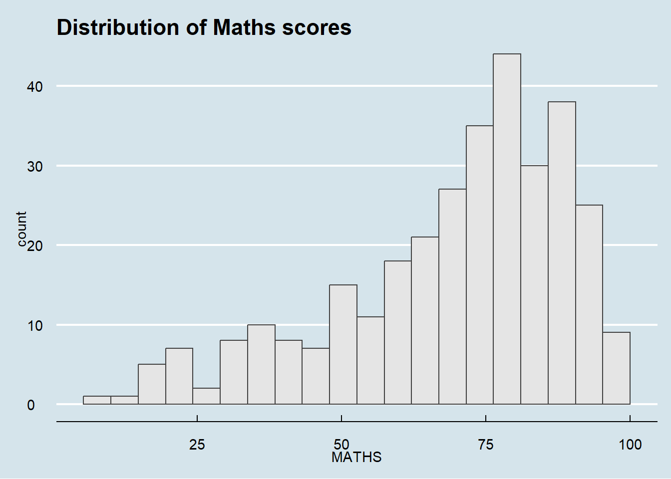
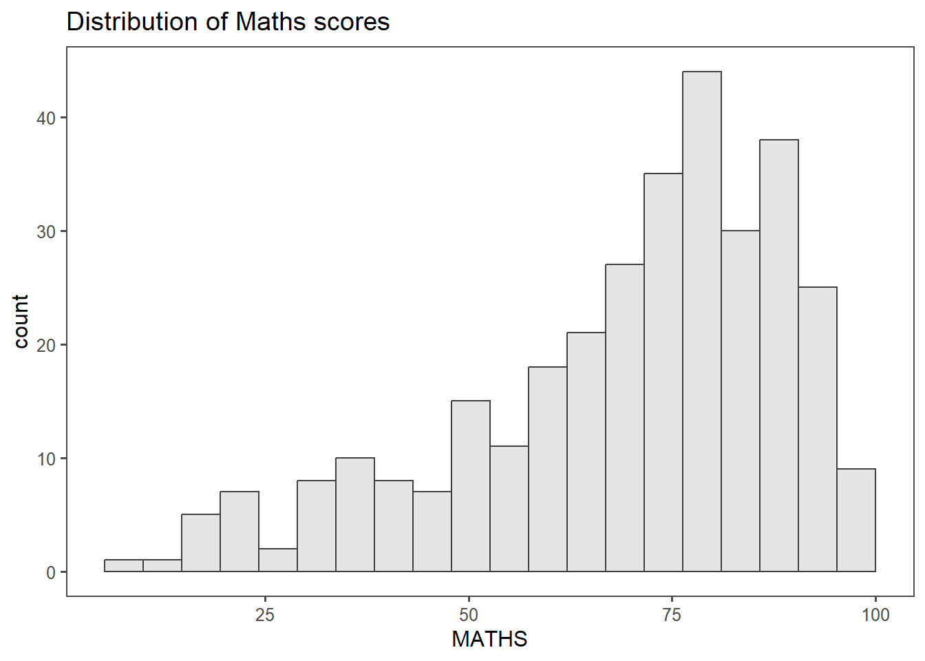
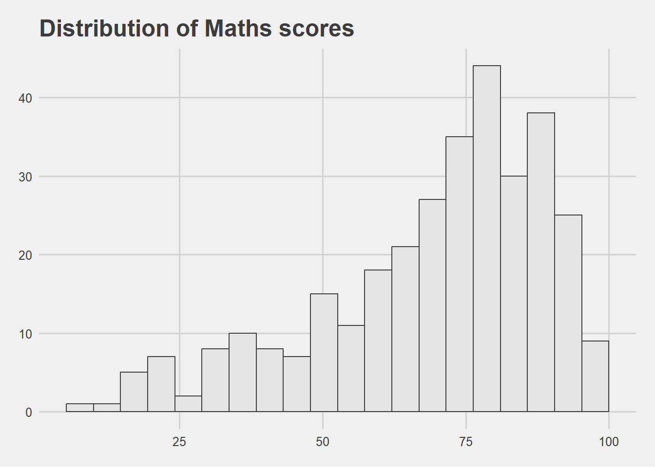
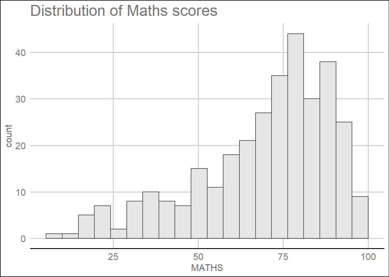
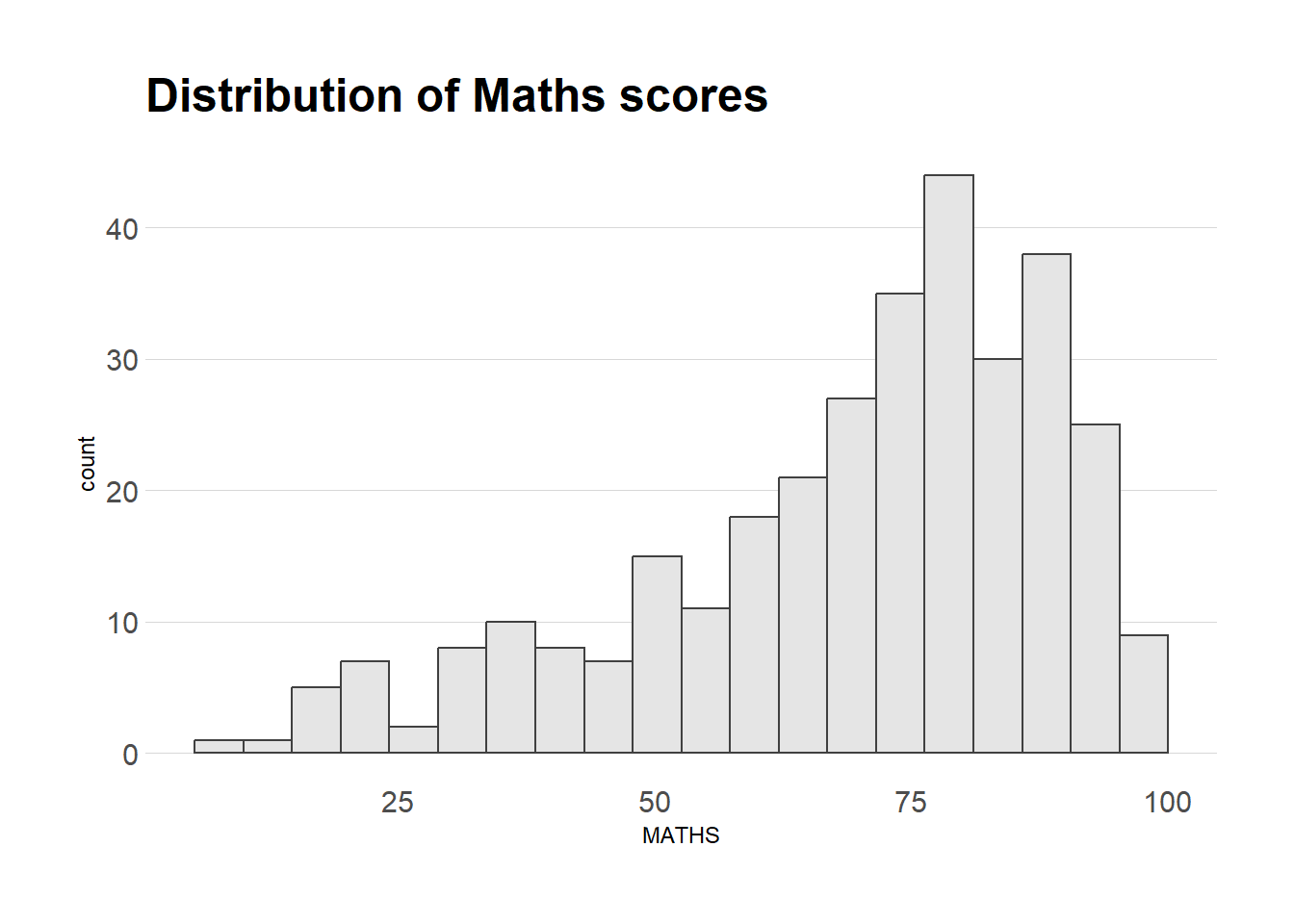
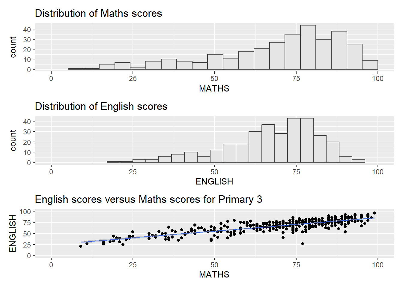
p1 <- ggplot(data=exam_data,
aes(x = MATHS)) +
geom_histogram(bins=20,
boundary = 100,
color="grey25",
fill="grey90") +
coord_cartesian(xlim=c(0,100)) +
ggtitle("Distribution of Maths scores")
p2 <- ggplot(data=exam_data,
aes(x = ENGLISH)) +
geom_histogram(bins=20,
boundary = 100,
color="grey25",
fill="grey90") +
coord_cartesian(xlim=c(0,100)) +
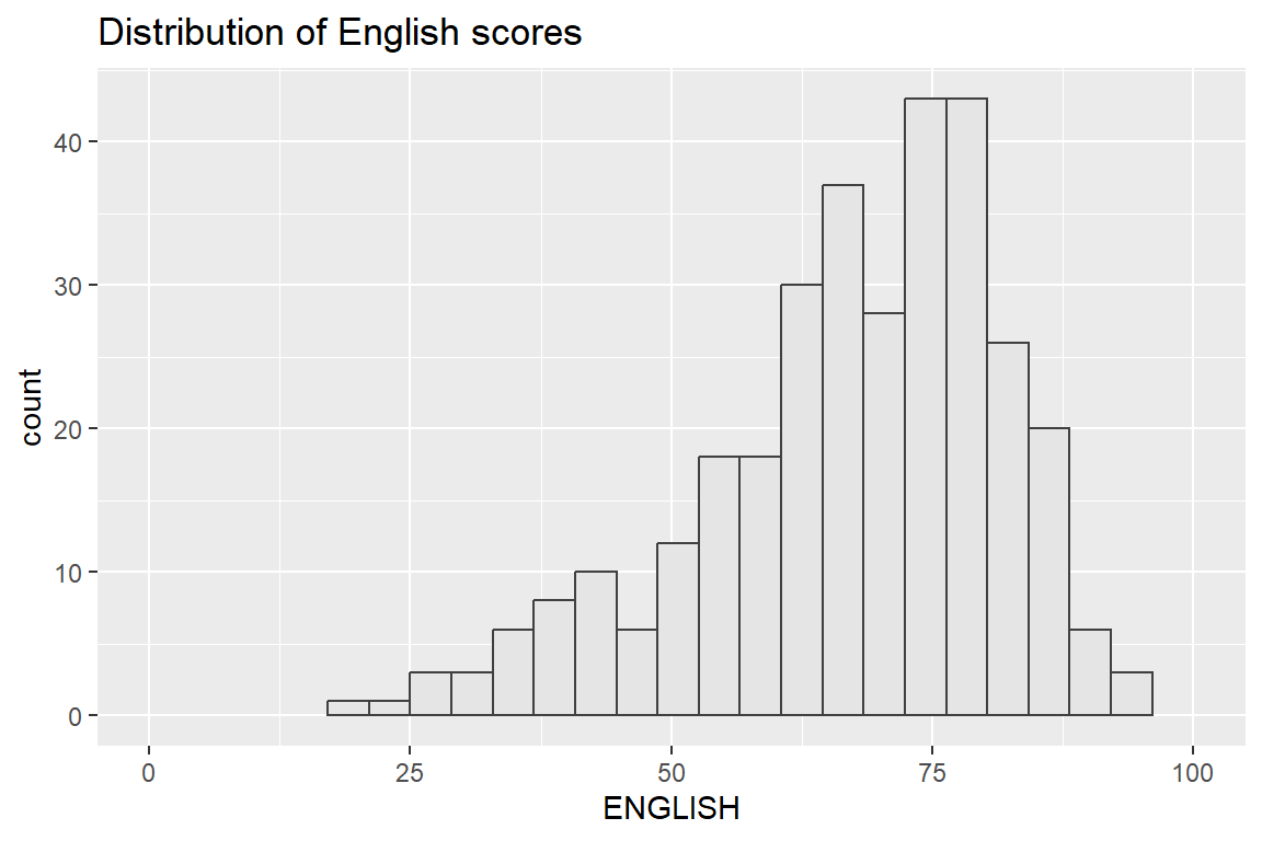
ggtitle("Distribution of English scores")
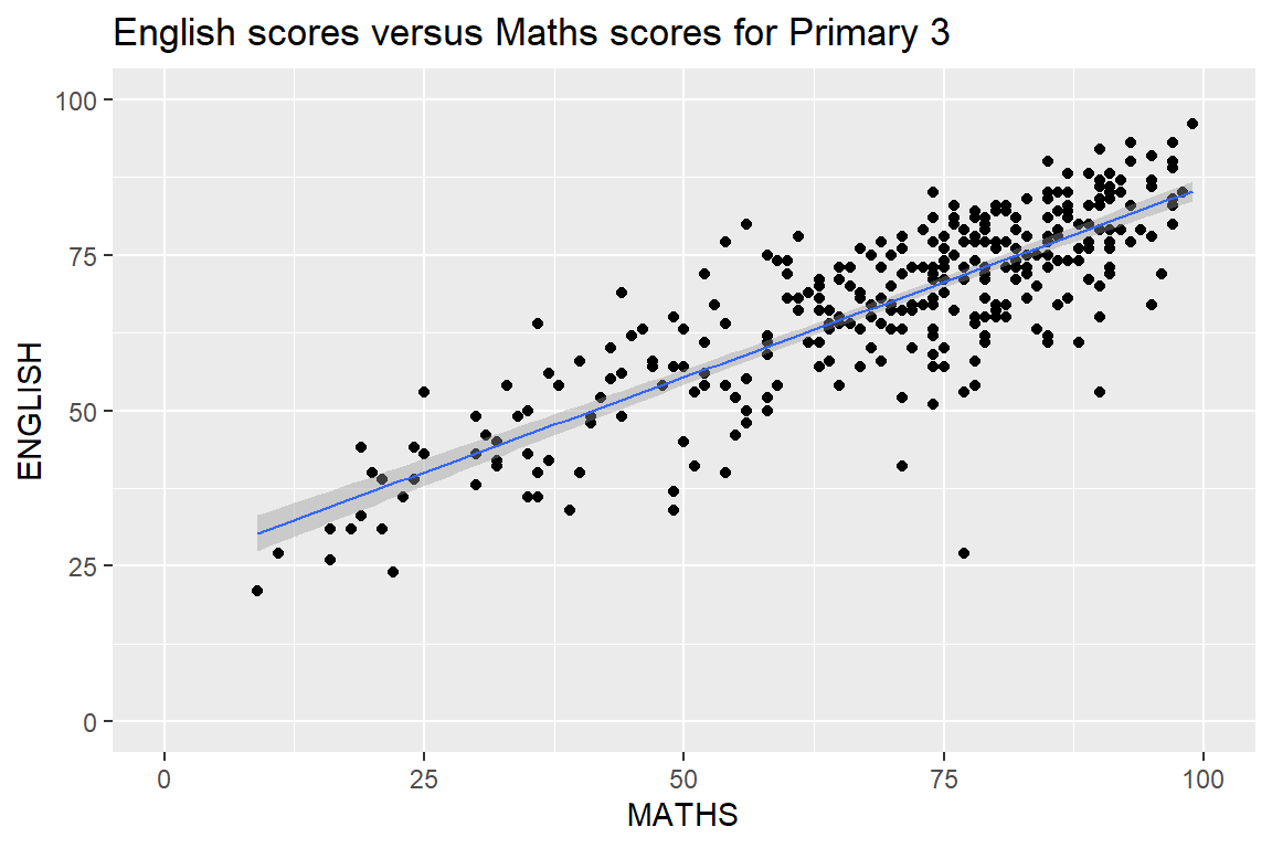
p3 <- ggplot(data=exam_data,
aes(x= MATHS,
y=ENGLISH)) +
geom_point() +
geom_smooth(method=lm,
size=0.5) +
coord_cartesian(xlim=c(0,100),
ylim=c(0,100)) +
ggtitle("English scores versus Maths scores for Primary 3")
p1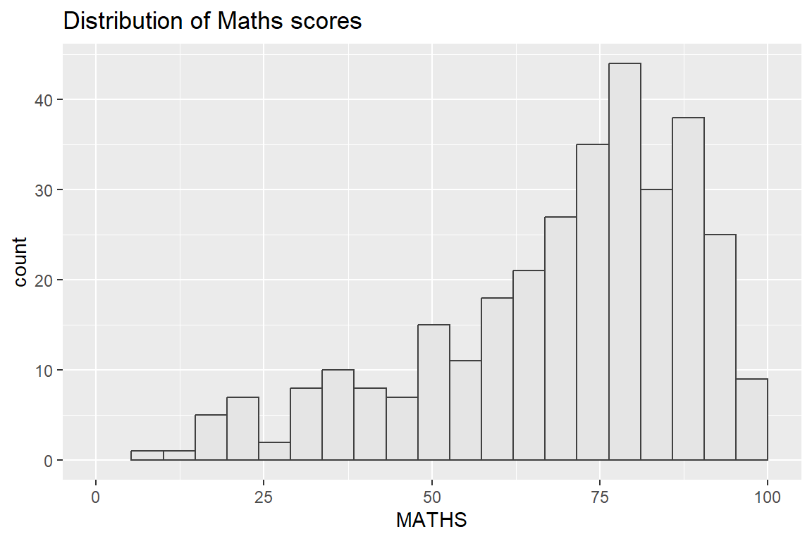
2.5.1 Creating Composite Graphics with pathwork package
There are several ggplot2 extensions which provide functions to compose figure with multiple graphs. In this section, we are going to explore patchwork.
The patchwork package has a very simple syntax where we can create layouts super easily.
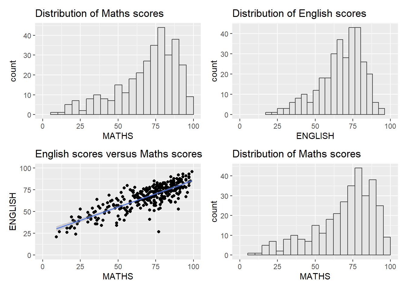
We can use | to place the plots beside each other, while / will stack them
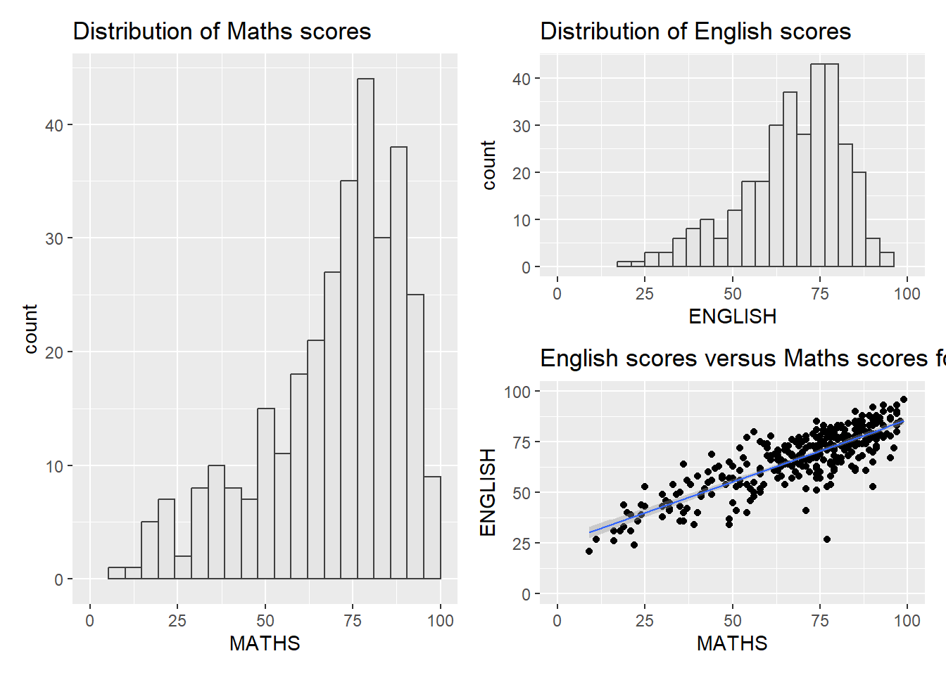
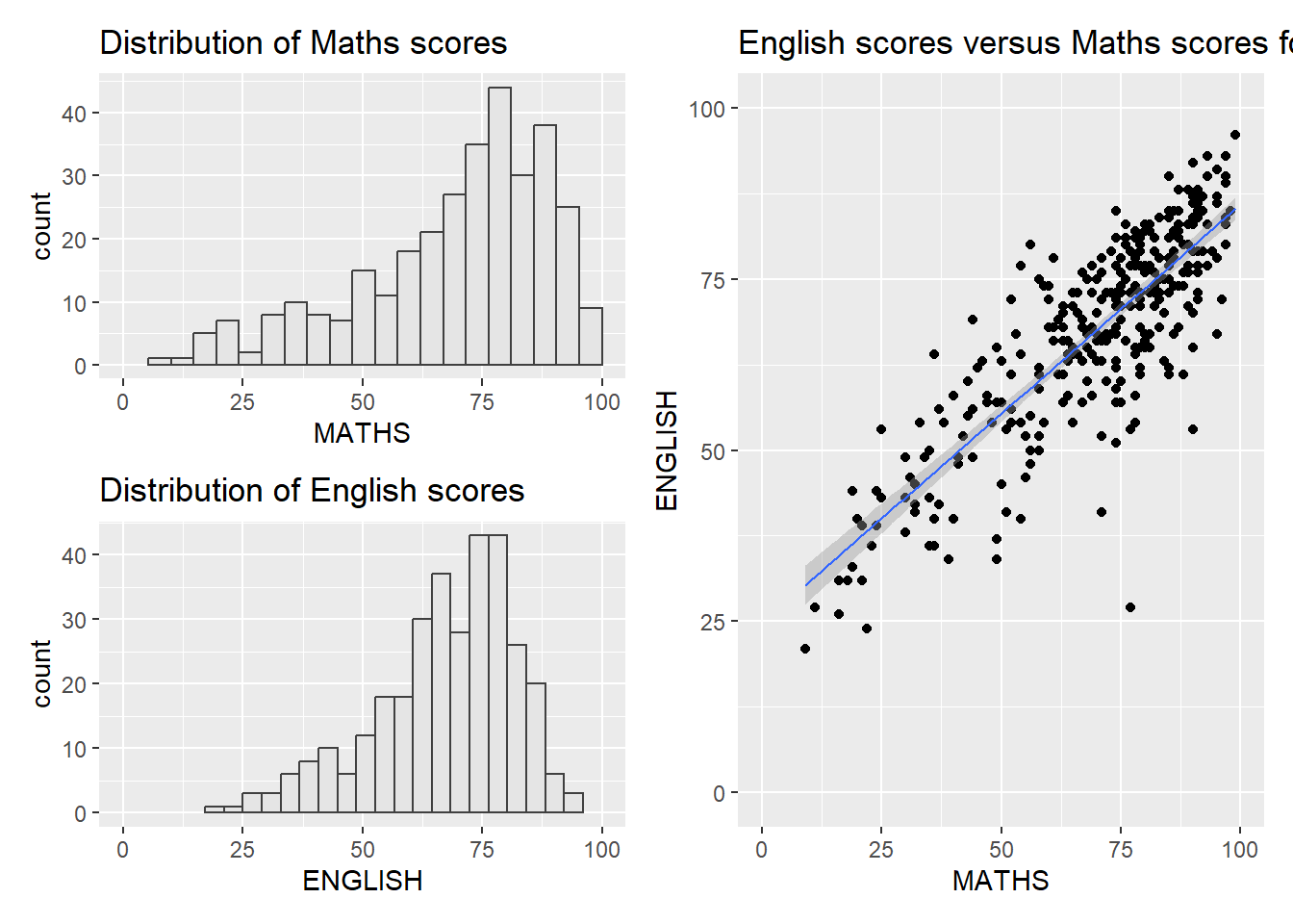
patchwork also provides auto-tagging capabilities, in order to identify subplots in text
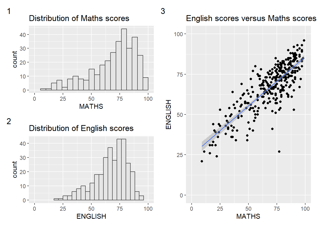
We can apply themes to the charts
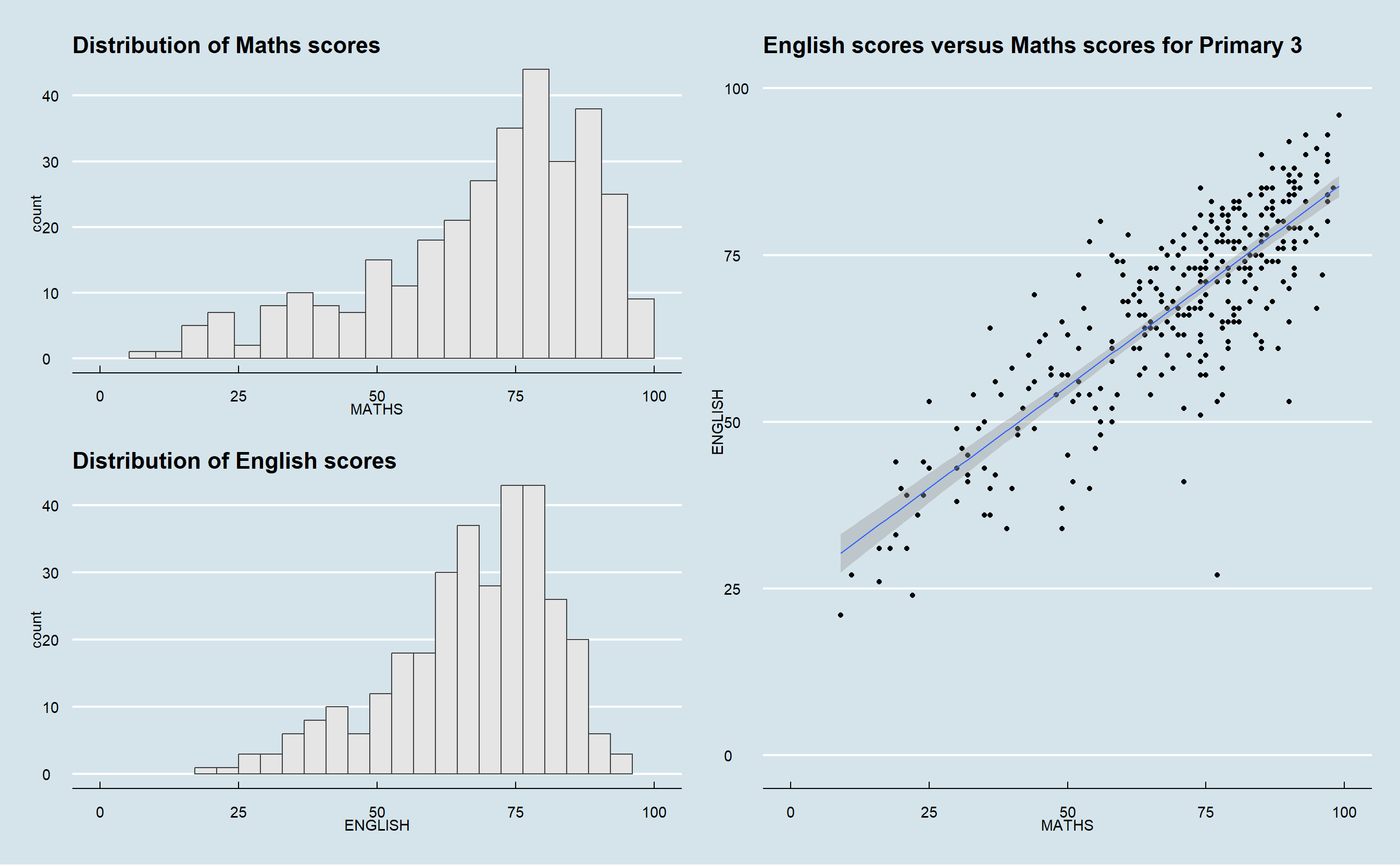
Beside providing functions to place plots next to each other based on the provided layout. With inset_element() of patchwork, we can place one or several plots or graphic elements freely on top of another plot.
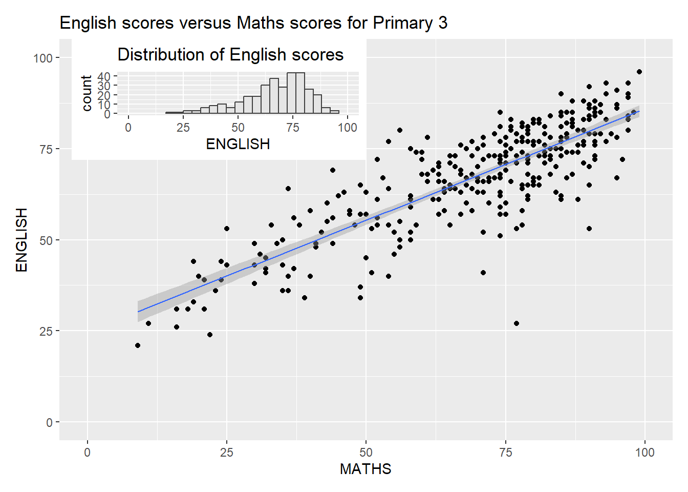
Refer to Plot Assembly to learn more about arranging charts using patchwork.
2.6 References
\(**That's\) \(all\) \(folks!**\)