7 Funnel Plots for Fair Comparison
Hands-On Exercise for Week 4
(First Published: May 4, 2023)
7.1 Learning Outcome
Funnel plot is a specially designed data visualisation for conducting unbiased comparison between outlets, stores or business entities.
In this hands-on exercise, we will learn to design and produce static and interactive funnel plots.
7.2 Getting Started
7.2.1 Install and load the required r libraries
Install and load the the required R packages. The name and function of the new packages that will be used for this exercise are as follow:
FunnelPlotR for creating funnel plot
kableExtra for additional functionality to format
kable()tables
7.2.2 Import the data
We will be using the COVID-19_DKI_Jakarta data-set. The data was downloaded from Open Data Covid-19 Provinsi DKI Jakarta portal. For this exercise, we are going to compare the cumulative COVID-19 cases and death by sub-district (i.e. kelurahan) as at 31st July 2021, DKI Jakarta.
We import the data into R and save it into a tibble data frame object called covid19.
Show the code
| Sub-district ID | City | District | Sub-district | Positive | Recovered | Death |
|---|---|---|---|---|---|---|
| 3172051003 | JAKARTA UTARA | PADEMANGAN | ANCOL | 1776 | 1691 | 26 |
| 3173041007 | JAKARTA BARAT | TAMBORA | ANGKE | 1783 | 1720 | 29 |
| 3175041005 | JAKARTA TIMUR | KRAMAT JATI | BALE KAMBANG | 2049 | 1964 | 31 |
| 3175031003 | JAKARTA TIMUR | JATINEGARA | BALI MESTER | 827 | 797 | 13 |
| 3175101006 | JAKARTA TIMUR | CIPAYUNG | BAMBU APUS | 2866 | 2792 | 27 |
| 3174031002 | JAKARTA SELATAN | MAMPANG PRAPATAN | BANGKA | 1828 | 1757 | 26 |
7.3 FunnelPlotR methods
FunnelPlotR package uses ggplot to generate funnel plots. It requires a numerator (events of interest), denominator (population to be considered) and group. The key arguments selected for customisation are:
limit: plot limits (95 or 99).label_outliers: label outliers (true or false).Poisson_limits: add Poisson limits to the plot.OD_adjust: add overdispersed limits to the plot.xrangeandyrange: specify the range to display for axes, acts like a zoom function.Other aesthetic components such as graph title, axis labels etc.
Check out this video which explains the elements of the funnel plot and how it is constructed.
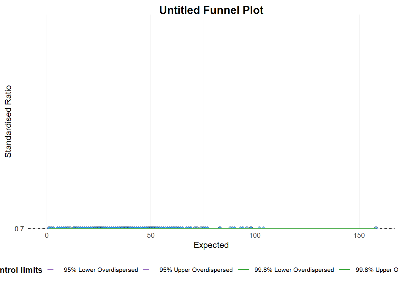
7.3.1 FunnelPlotR methods: The Basic Plot
We use the funnel_plot() function to create a basic plot. Things to note:
groupargument is different from that in the scatterplot. Here, it specifics the level of the points to be plotted i.e. Sub-district, District or City. If City is chosen, there will only be six data points.By default,
data_typeargument is “SR”.limit: the accepted plot limit values are: 95 or 99, corresponding to 95% or 99.8% quantiles of the distribution.
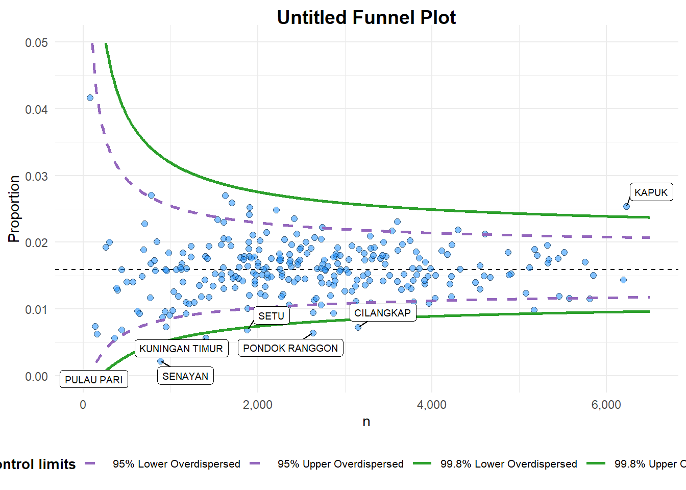
7.3.2 FunnelPlotR methods: Makeover Part 1
We updated the arguments used in the funnel_plot() function to create the following plot:
data_type: A character string specifying the type of data to be plotted. In this case, it is set to “PR”, which stands for proportion or percentage, indicating that the data in thenumeratoranddenominatorarguments are in the form of proportions or percentages, and not absolute counts.x_range: A numeric vector of length two specifying the range of the x-axis of the plot. Here, it is set toc(0, 6500), which means the x-axis ranges from 0 to 6500.y_range: A numeric vector of length two specifying the range of the y-axis of the plot. Here, it is set toc(0, 0.05), which means the y-axis ranges from 0 to 0.05.
7.3.3 FunnelPlotR methods: Makeover Part 2
Further updates to the relevant arguments of the funnel_plot() function are:
label: A logical value indicating whether or not to display the group labels on the plot. Here, it is set toNA, which means that no labels will be displayed.title: A character string specifying the title of the plot. Here, it is set to “COVID-19 Fatality Rate by Total Number of COVID-19 Positive Cases”.x_label: A character string specifying the label for the x-axis of the plot. Here, it is set to “COVID-19 Positive Cases”.y_label: A character string specifying the label for the y-axis of the plot. Here, it is set to “Fatality Rate”.
Show the code
funnel_plot(
numerator = covid19$Death,
denominator = covid19$Positive,
group = covid19$`Sub-district`,
data_type = "PR",
x_range = c(0, 6500),
y_range = c(0, 0.05),
label = NA,
title = "COVID-19 Fatality Rate by Total Number of COVID-19 Positive Cases", #<<
x_label = "COVID-19 Positive Cases", #<<
y_label = "Fatality Rate" #<<
)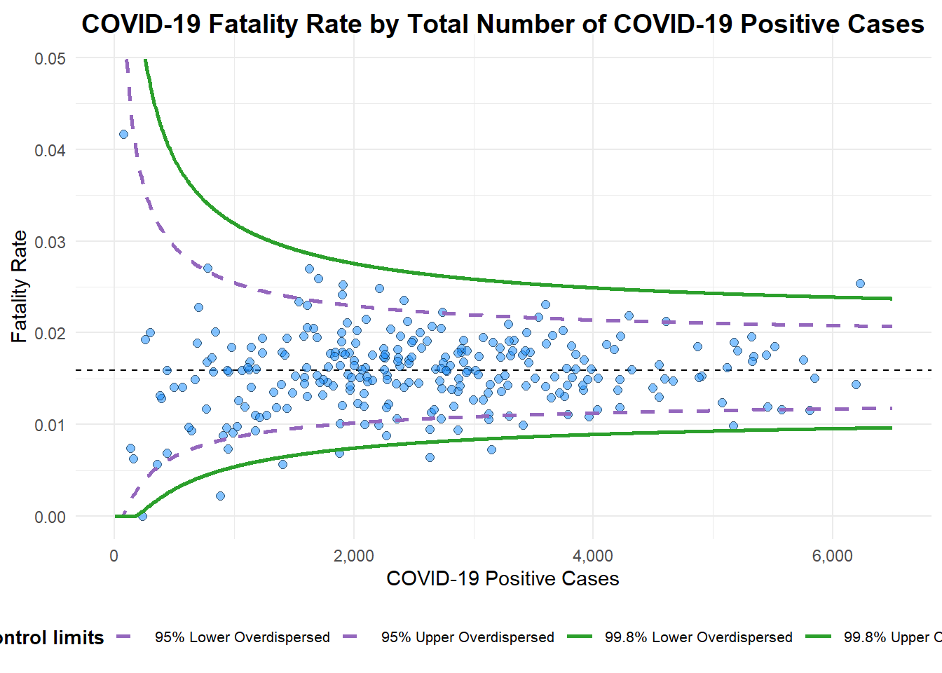
A funnel plot object with 267 points of which 7 are outliers.
Plot is adjusted for overdispersion. 7.4 Funnel Plot for Fair Visual Comparison using ggplot2 package
In this section, we will learn to build funnel plots step-by-step by using ggplot2. This will enhance our working experience of ggplot2 to customise a speciallised data visualisation like funnel plot.
7.4.1 Derive the basic statistics
To plot the funnel plot from scratch, we need to derive cumulative death rate (or fatality rate) and standard error of cumulative death rate.
Next, we derive the weighted mean of the values. In this case, we use the weighted.mean() function to find the weighted mean of the rate values.
7.4.2 Calculate lower and upper limits for 95% and 99.9% Confidence Interval
We will then compute the lower and upper limits for 95% and 99.9% confidence interval.
Show the code
number.seq <- seq(1, max(df$Positive), 1)
number.ll95 <- fit.mean - 1.96 * sqrt((fit.mean*(1-fit.mean)) / (number.seq))
number.ul95 <- fit.mean + 1.96 * sqrt((fit.mean*(1-fit.mean)) / (number.seq))
number.ll999 <- fit.mean - 3.29 * sqrt((fit.mean*(1-fit.mean)) / (number.seq))
number.ul999 <- fit.mean + 3.29 * sqrt((fit.mean*(1-fit.mean)) / (number.seq))

dfCI <- data.frame(number.ll95, number.ul95, number.ll999,
                   number.ul999, number.seq, fit.mean)

kable(head(dfCI), format = 'html', caption = "Table 2 First Records of CI Intervals and Fit.Mean Value")%>%
kable_styling("striped")| number.ll95 | number.ul95 | number.ll999 | number.ul999 | number.seq | fit.mean |
|---|---|---|---|---|---|
| -0.2230353 | 0.2529745 | -0.3845386 | 0.4144778 | 1 | 0.0149696 |
| -0.1533253 | 0.1832645 | -0.2675254 | 0.2974645 | 2 | 0.0149696 |
| -0.1224426 | 0.1523818 | -0.2156866 | 0.2456257 | 3 | 0.0149696 |
| -0.1040328 | 0.1339720 | -0.1847845 | 0.2147237 | 4 | 0.0149696 |
| -0.0914694 | 0.1214086 | -0.1636959 | 0.1936351 | 5 | 0.0149696 |
| -0.0821955 | 0.1121347 | -0.1481289 | 0.1780681 | 6 | 0.0149696 |
7.4.3 Create a static funnel plot
We can use ggplot2 functions to plot a static funnel plot
Show the code
p <- ggplot(df, aes(x = Positive, y = rate)) +
  geom_point(aes(label=`Sub-district`),
             alpha=0.4) +
  geom_line(data = dfCI,
            aes(x = number.seq,
                y = number.ll95),
            linewidth = 0.4,
            colour = "grey40",
            linetype = "dashed") +
  geom_line(data = dfCI,
            aes(x = number.seq,
                y = number.ul95),
            linewidth = 0.4,
            colour = "grey40",
            linetype = "dashed") +
  geom_line(data = dfCI,
            aes(x = number.seq,
                y = number.ll999),
            linewidth = 0.4,
            colour = "grey40") +
  geom_line(data = dfCI,
            aes(x = number.seq,
                y = number.ul999),
            linewidth = 0.4,
            colour = "grey40") +
  geom_hline(data = dfCI,
             aes(yintercept = fit.mean),
             linewidth = 0.4,
             colour = "grey40") +
  coord_cartesian(ylim=c(0,0.05)) +
  annotate("text", x = 1, y = -0.13, label = "95%", size = 3, colour = "grey40") +
  annotate("text", x = 4.5, y = -0.18, label = "99%", size = 3, colour = "grey40") +
  ggtitle("Fatality Rate by Number of COVID-19 Cases") +
  xlab("Number of COVID-19 Cases") +
  ylab("Fatality Rate") +
  theme_light() +
  theme(plot.title = element_text(size=12),
        legend.position = c(0.91,0.85),
        legend.title = element_text(size=7),
        legend.text = element_text(size=7),
        legend.background = element_rect(colour = "grey60", linetype = "dotted"),
        legend.key.height = unit(0.3, "cm"))
p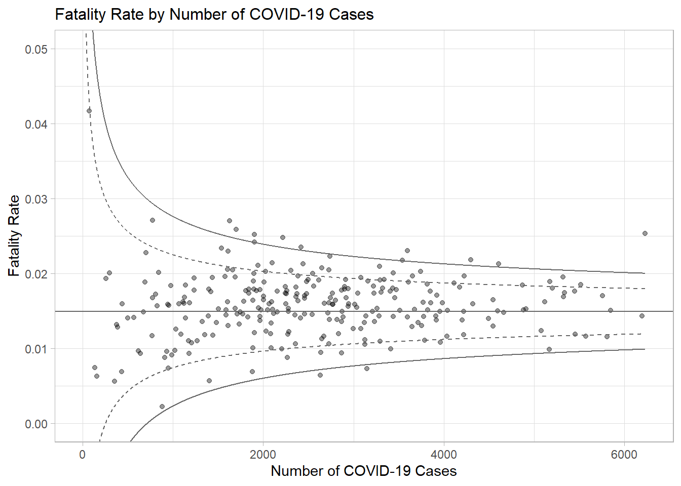
7.4.4 Create an Interactive Funnel Plot
The funnel plot created using ggplot2 functions above can be made interactive with ggplotly() of plotly package.
7.5 References
funnelPlotR package.
ggplot2 package.
\(**That's\) \(all\) \(folks!**\)